
The story of a feature: “View my invoices”

Will Grant
on 9 June 2021
In this blog post, I’ll do a deep dive into the process of designing a small feature on ubuntu.com – from the original need, right through the design phase until it’s handed over to engineering. It intends to give you a good high-level overview of how we do user experience (UX) design at Canonical on a small feature like this.
Background
Our customers can pay for their Ubuntu Advantage subscriptions annually or monthly, but right now they only receive an invoice over email. This is fine for an MVP but not a very complete user experience.
We want to allow customers to see a list of their invoices, download them, and manage their payment methods.
This is just one small item on a busy roadmap, so we need to be efficient and produce a great solution in just a couple of weeks.
User Research
Thanks to our User Interview Group we have a thriving community of 100s of customers who are ready and willing to take part in user interviews (you can join the group if you’re interested).
We conducted user interviews with a diverse group of Ubuntu users, including;
- A sysadmin at a major university
- A board-level IT director responsible for support
- A co-founder of a specialised technology company
- A less-experienced IT professional running a multi-client agency
From this we were able to learn a great deal about the various reasons for buying Ubuntu Advantage, and how our customers like to purchase and consume the service.
Some of our key takeaways from this research are;
- “I pay on my own card for a few machines, and I need to get an invoice so that I can pass it to Finance.”
- “We support a lot of machines, so I’d rather be invoiced for a year of support at a time instead of month by month.”
- “Sometimes I do forget to file the invoices, and searching my mail for them is a pain.”
All really useful insight that we can build into our design – and validate design decisions we’re making.
User stories and features
Based on our research, best practices and our product knowledge, we can construct a simple list of user stories in the format:
“As a [type of user] I want to [do something] so that I can [achieve a goal or complete a task]”.
As an example, based on our research, we knew that users wanted easy, direct access to invoices – so we should add a story for this.
This is a long-standing UX method that helps designers get a complete picture of the users’ needs for a feature. We might not capture everything in this first version, but we should be sure that we’ve met the needs expressed in our research phase, as well as any business needs that we’re aware of.

Above: a basic set of user stories for this feature.
We then specify and map these use cases onto required features. This is a good technique to ensure we haven’t missed anything; an unmet user need on the left-hand side or a feature that’s not really needed on the right-hand side.
Again in our example, we could offer users a direct, one-click download of a PDF of each invoice to fulfil the user story.

Above: mapping user stories onto features.
API liaison
By this point, we have some clear ideas of the features we need to present to our users.
The front end (the UI you see in the browser) relies on the back end to provide its data, which comes through an API. We can only offer the customer an experience that can be delivered through our supported API, so now’s the time to talk to our engineering team and check that what we have in mind is possible.
In this case, our API supported getting the individual dollar value of an invoice when the list of users invoices was requested, the dollar amount wasn’t included. This would mean the frontend having to iterate through the invoices, which is slow and resource-intensive.
Instead, our backend team took an issue to enrich the API response with the dollar amount of each invoice in the list.
If we had skipped this step, we’d have ended up with a much poorer user experience or created some last-minute work for engineering – both of which are undesirable outcomes.
Experience design and engineering aim to work closely with each other to deliver the best possible outcomes for our customers.
Wireframes
Wireframes are very rough page designs that intend to show how the views of the app will look – without the distraction of making them look nice!
Wireframes are quick to make and let visual designers and engineers understand the UX design intentions for a feature.
In the examples below, we’re showing both an “archetype” – how we’d like the view to look eventually, and an “MVP” – a Minimum Viable Product which we feel is the bare minimum functionality we can release and it still be of use to our customers.
This approach lets our team understand not only the design for this iteration but where we’re headed in the future – so they can make better decisions about their work.

Above: the ‘archetype’ for this view.
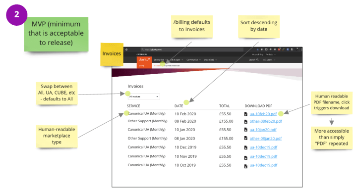
Above: the ‘MVP’ version of the view.
UX Peer Review
We never work alone! We believe our best work comes from collaboration, so all of our work is reviewed by our peers to ensure we’ve not missed things and so that other perspectives are considered.
You won’t always accept all the changes and proposals that are suggested by your teammates, but often there will be one or two “aha!” moments where a fresh perspective unlocks something that you were stuck on.

Above: a useful suggestion from a peer review.
Visual design
The final step before we hand our work over to the front-end engineers is the visual design stage. Working with the Vanilla Framework, our Senior Visual Designer will take the basic wireframes and transform them into simple, elegant, high fidelity mock-ups of the pages.
Thinking about information hierarchy, typography and sticking to the patterns within the Vanilla framework, they’ll ensure that the feature is usable and consistent with the rest of the product.

Above: a high fidelity mockup of the view, ready for engineering.
During the production stage, the designer will assist the front-end engineer on any issues/constraints and will review the developed project making sure that all visual and technical components are displayed and functioning properly.
And that’s it for this deep-dive. You can see more of our work on Instagram @ubuntudesigners, follow us on Twitter @ubuntudesigners – and don’t forget to check open positions if you’d like to join our team.
Talk to us today
Interested in running Ubuntu in your organisation?
Newsletter signup
Related posts
In pursuit of quality: UX for documentation authors
Canonical’s Platform Engineering team has been hard at work crafting documentation in Rockcraft and Charmcraft around native support for web app frameworks...
How we ran a sprint to refresh our design website, Part 2
Part 2 of our series on how our team created content for our design website. Get insights, tools, and lessons to help you run your own design sprint.
Improving our web page creation workflow: how structured content is slashing design and development time
Co-authored with Julie Muzina A year ago, during our Madrid Engineering Sprint, we challenged ourselves to dramatically reduce, or even eliminate, the need...