The browser is dead. Long live the browser!
Canonical
on 15 May 2014
Tags: Design
With the unstoppable rise of mobile apps, some pundits within the tech industry have hastily demoted the mobile web to a second-class citizen, or even dismissed it as ‘dead’. Who cares about websites and webapps when you can deliver a superior user experience with a native app?
Well, we care because the reality is a bit different. New apps are hard to discover; their content is locked, with no way to access it from the outside. People browse the web more than ever on their mobile phones. The browser is the most used app on the phone, both as starting point and a destination in the user journey.

Source: xkcd
At Ubuntu, we decided to focus on improving the user experience of browsing and searching the web. Our approach is underpinned by our design principles, namely:
- Content is king: UI should recede in the background once user starts interacting with content
- Leverage natural interaction by using gestures and spatial metaphors.
In designing the browser, there’s one more principle we took into account. If content is our king, then recency should be our queen.
Recency is queen
People forget about things. That’s why tasks such as finding a page you visited yesterday or last week can be very hard: UIs are not designed to support the long-term memory of the user. For example, when browsing tabs on a smartphone touchscreen, it is hard to recognise what’s on screen as we forgot what that page is and why we arrived there.
Similarly, bookmarks are often a meaningless list of webpages, as their value was linked to the specific time when they were taken. For example, let’s imagine we are planning our next holiday and we start bookmarking a few interesting places. We may even create a new ‘holidays’ folder and add the bookmarks to it. However, once the holiday is the bookmarks are still there, they don’t expire once they have lost their value. This happens pretty much every time; old bookmarks and folders will eventually start cluttering our screen and make it difficult to find the information we need.
Therefore we redesigned tabs, history and bookmarks to display the most recent information first. Consequently, the display and the retrieval of information is simplified.
Browser tabs
In our browser, most recent tabs come first. Here is how it works:

In this way, users don’t have to painstakingly browse an endless list of tabs that may have been opened weeks or days ago, like in Mobile Safari or Chrome.
History
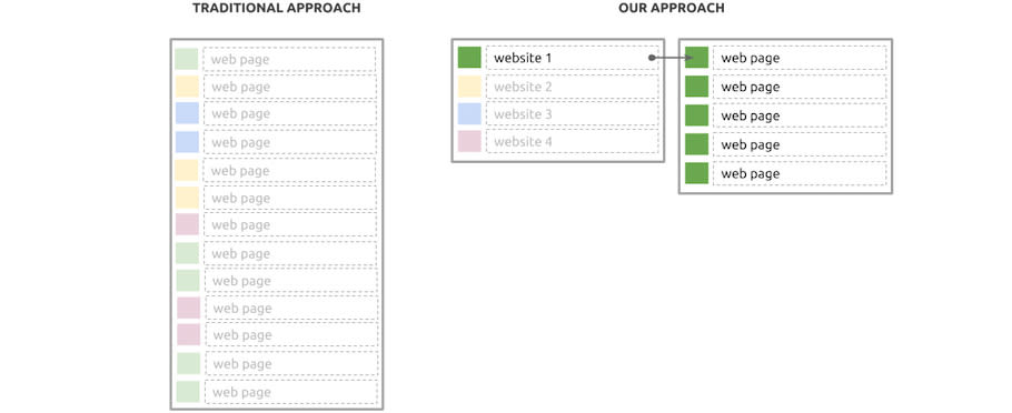
Browser history has not changed much since Netscape Navigator; modern browser still display a chronological log of all the web pages we visited starting from today. Finding a website or a page is hard because of the sheer amount of information. In our browser we employ a clustered model where you display the last visited websites, not every single page. On tap, you then display all webpages for that websites, starting from the most recent. In this way scanning the history log is much easier and less painful.

Loving the bottom edge
We believe the bottom edge is the most pleasurable edge to use. It is easily accessible at any time and ergonomically friendly to the typical one-hand phone hold. Once discovered, it will slowly build into our muscle memory and become a natural and intuitive way of interacting with the application.

This is why we combined tabs and history and made them accessible through the bottom edge. As a team, we spent months building and refining a sleek, intuitive and fluid user experience.
Here’s a sneak preview of how it will look like:
Video: Browser interactions
Bottom edge gesture will have three stages:
- Dragging from the bottom edge will hint and reveal the most recently viewed tab
- Continue dragging and the full tab spread is revealed
- Keep on dragging and browser history will be fully revealed.
All elements will support gestural interaction: user can swipe to delete a tab or a website from history.
That’s all for now. In the next blog post, we will talk more about gestural interaction in Browser. Stay tuned!
Talk to us today
Interested in running Ubuntu in your organisation?
