
%27%20fill%3D%27%23E95420%27%3E%3Cpath%20d%3D%27m15.839%205.293-1.447-2.8a.136.136%200%200%200-.051-.055.144.144%200%200%200-.074-.02h-5.8a.143.143%200%200%200-.091.03.13.13%200%200%200-.034.17.138.138%200%200%200%20.072.06l7.251%202.8a.144.144%200%200%200%20.17-.054.13.13%200%200%200%20.007-.13l-.003-.001ZM11.839%204.945.073.223A.073.073%200%200%200%20.026.221a.07.07%200%200%200-.038.027.065.065%200%200%200%20.007.086l7.962%208.182a.069.069%200%200%200%20.049.022.072.072%200%200%200%20.047-.019l3.805-3.461a.066.066%200%200%200%20.02-.061.065.065%200%200%200-.014-.03.07.07%200%200%200-.028-.02l.003-.002ZM5.382%207.183a.071.071%200%200%200-.062-.022.07.07%200%200%200-.03.011.067.067%200%200%200-.023.025l-4.13%207.696a.065.065%200%200%200-.005.046.068.068%200%200%200%20.027.038.072.072%200%200%200%20.09-.006L7.13%209.18a.066.066%200%200%200%200-.087l-1.75-1.91Z%27%2F%3E%3C%2Fg%3E%3Cdefs%3E%3CclipPath%20id%3D%27a%27%3E%3Cpath%20fill%3D%27%23fff%27%20d%3D%27M0%200h15.83v15.21H0z%27%2F%3E%3C%2FclipPath%3E%3C%2Fdefs%3E%3C%2Fsvg%3E)

%27%20fill%3D%27%23E95420%27%3E%3Cpath%20d%3D%27M1.936%202.592c.668%200%201.21-.515%201.21-1.151S2.604.29%201.936.29C1.267.29.726.805.726%201.44c0%20.637.541%201.152%201.21%201.152ZM14.56.576H3.404a1.587%201.587%200%200%201%20.024%201.69l-.026.04h11.156a.56.56%200%200%200%20.386-.15.518.518%200%200%200%20.16-.369v-.692a.502.502%200%200%200-.16-.369.543.543%200%200%200-.386-.15ZM1.936%206.701c.668%200%201.21-.515%201.21-1.15%200-.637-.542-1.152-1.21-1.152-.669%200-1.21.515-1.21%201.151s.541%201.151%201.21%201.151ZM14.56%204.685H3.404a1.612%201.612%200%200%201%20.242%201.083c-.03.215-.105.421-.219.608l-.026.04h11.157a.56.56%200%200%200%20.386-.15.518.518%200%200%200%20.16-.37v-.692a.5.5%200%200%200-.16-.369.542.542%200%200%200-.386-.15ZM1.936%2010.81c.668%200%201.21-.515%201.21-1.15%200-.637-.542-1.152-1.21-1.152-.669%200-1.21.515-1.21%201.151s.541%201.151%201.21%201.151ZM14.56%208.795H3.404a1.611%201.611%200%200%201%20.243%201.082%201.581%201.581%200%200%201-.245.648h11.156a.559.559%200%200%200%20.386-.15.517.517%200%200%200%20.16-.37v-.692a.502.502%200%200%200-.16-.368.543.543%200%200%200-.386-.15ZM1.936%2014.92c.668%200%201.21-.515%201.21-1.15%200-.637-.542-1.152-1.21-1.152-.669%200-1.21.515-1.21%201.151s.541%201.151%201.21%201.151ZM14.56%2012.904H3.404a1.611%201.611%200%200%201%20.242%201.082%201.58%201.58%200%200%201-.219.608l-.026.04h11.157a.562.562%200%200%200%20.386-.15.517.517%200%200%200%20.16-.37v-.692a.5.5%200%200%200-.16-.369.543.543%200%200%200-.386-.15Z%27%2F%3E%3C%2Fg%3E%3Cdefs%3E%3CclipPath%20id%3D%27a%27%3E%3Cpath%20fill%3D%27%23fff%27%20d%3D%27M0%200h15.83v15.21H0z%27%2F%3E%3C%2FclipPath%3E%3C%2Fdefs%3E%3C%2Fsvg%3E)
%27%20fill%3D%27%23E95420%27%3E%3Cpath%20d%3D%27M9.618.272c-.634%200-1.243.243-1.691.674-.448.43-.7%201.015-.701%201.624v4.221a1.9%201.9%200%200%201%201.362%200v-4.22a.955.955%200%200%201%20.291-.72%201.067%201.067%200%200%201%201.479%200%20.955.955%200%200%201%20.29.719v.962h1.363V2.57c0-.61-.253-1.194-.702-1.625A2.445%202.445%200%200%200%209.618.272ZM9.017%208.433c0%20.21-.065.417-.187.593a1.102%201.102%200%200%201-.499.393c-.203.08-.426.102-.642.06a1.125%201.125%200%200%201-.568-.292%201.055%201.055%200%200%201-.304-.547%201.028%201.028%200%200%201%20.064-.616c.084-.195.226-.362.41-.479a1.143%201.143%200%200%201%201.401.133c.103.1.185.217.24.347.057.129.085.268.085.408ZM2.773%205.855c-.634.001-1.242.244-1.69.674C.633%206.96.381%207.545.38%208.154v4.082a1.901%201.901%200%200%201%201.363%200V8.154a.955.955%200%200%201%20.29-.719%201.067%201.067%200%200%201%201.479%200%20.955.955%200%200%201%20.29.719v.962h1.363v-.962c0-.61-.253-1.194-.702-1.625a2.444%202.444%200%200%200-1.69-.674ZM2.166%2013.878c0%20.21-.065.415-.186.59-.121.174-.294.31-.496.39-.202.08-.424.102-.638.06a1.119%201.119%200%200%201-.565-.29%201.049%201.049%200%200%201-.302-.543c-.043-.206-.02-.42.063-.614.084-.194.225-.36.407-.476a1.136%201.136%200%200%201%201.394.133%201.024%201.024%200%200%201%20.323.75Z%27%2F%3E%3Cpath%20d%3D%27M14.752%204.76a1.789%201.789%200%200%201-.681-.126v2.411a.972.972%200%200%201-.312.682c-.193.179-.45.28-.718.28-.268%200-.526-.101-.718-.28a.972.972%200%200%201-.312-.682V4.32h-1.363v2.726c0%20.61.252%201.195.7%201.626a2.443%202.443%200%200%200%201.692.673c.635%200%201.244-.242%201.692-.673.449-.431.7-1.016.7-1.626v-2.41a1.9%201.9%200%200%201-.68.125ZM15.858%202.822c.037.225%200%20.455-.107.658a1.1%201.1%200%200%201-.49.472%201.161%201.161%200%200%201-1.302-.198%201.04%201.04%200%200%201-.206-1.251%201.1%201.1%200%200%201%20.492-.47%201.161%201.161%200%200%201%201.299.199c.166.16.276.366.314.59ZM7.907%2010.2c-.233%200-.465-.042-.681-.126V12.6a.97.97%200%200%201-.302.7%201.05%201.05%200%200%201-.728.29%201.05%201.05%200%200%201-.728-.29.97.97%200%200%201-.302-.7V9.845H3.804V12.6c0%20.61.252%201.194.7%201.625a2.443%202.443%200%200%200%201.692.674c.634%200%201.243-.243%201.692-.674.448-.43.7-1.015.7-1.625v-2.526a1.887%201.887%200%200%201-.68.127Z%27%2F%3E%3C%2Fg%3E%3Cdefs%3E%3CclipPath%20id%3D%27a%27%3E%3Cpath%20fill%3D%27%23fff%27%20d%3D%27M0%200h15.83v15.21H0z%27%2F%3E%3C%2FclipPath%3E%3C%2Fdefs%3E%3C%2Fsvg%3E)

Music app: focus on the content

Canonical
on 20 August 2013
Tags: Design
Music apps that allow users to switch between player and queue mode can be quite complex. Some challenges of music apps in general:
- Deep navigation through the music library:
Home › Artists › Artist › Album › Play queue - Switching between play queue and library
And a challenge unique for the Ubuntu phone:
- Keeping play controls easily accessible, while focusing on the content.
Tabs
The Ubuntu Music app is all about your music collection. The home screen shows a list of recently played items and the musical genres in your collection. It is easy to find your way around with the tab navigation.
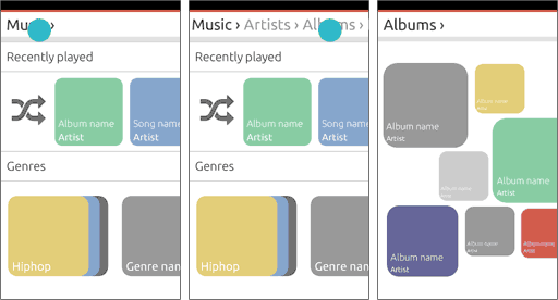
Let’s open one of the albums.

Player
Tap on a song to start playing it and enter the player view. This view combines full album art of the item that is currently playing, and a queue of all previous and next items. There are play controls in the toolbar at the bottom of the screen.

Queue
For the next example of what you can do with the queue, let’s imagine that we have already queued up a lot more songs from various albums.
Scroll down the list to see what’s coming up in the queue. When our focus changes from the current song to the rest of the queue, the toolbar with play controls contracts. A hint of a progress bar stays on the screen; not to interact with, but as a visual hint to show something is playing and as a reference to where the play controls are.

Users can remove songs from the queue by swiping, and move songs to a different position in the queue with drag and drop.
Bring up the toolbar with play controls to refocus on what is playing now. As the toolbar is swiped up, the queue moves back to the current item.

Back to the library
The user can go back to their library to find more songs to queue. Patterns for back and overflow in the toolbar are still in development so check the App design guides to find out how exactly this will work.

Back in the library view, we again see a hint of the progress bar to show that items are in the play queue. We bring up the toolbar and see the condensed play controls. The toolbar lets users tap play or pause on the current song, tap on the album art or song title to return to the player view, and open up the overflow actions.

We navigate to another album.

Item options
To keep our focus on play controls in the toolbar and keep the toolbar as light as possible, item actions are grouped with the item and accessible via the expansion pattern. This goes for library albums and songs and queued songs. We can queue another song of the album we are looking at with the song options.

What’s next
This is the basic UX concept for the music app. Visual design will play a big part in deciding what exactly goes where, and we will need to test if the controls are easy enough to access. Coming soon are some exciting visuals to connect the dots.
Talk to us today
Interested in running Ubuntu in your organisation?