
Making ubuntu.com responsive: making our grid responsive (8)

Inayaili de León Persson
on 29 May 2014
Tags: Design
This post is part of the series ‘Making ubuntu.com responsive‘.
A big part of converting our existing fixed-width desktop site to be responsive was to make sure we had a flexible grid that would flow seamlessly from small to large screens.
From the start, we decided that we were going to approach the move as simply as possible: we wanted the content our grid holds to become easier to read and browse on any screen size, but that doesn’t necessarily mean creating anything too complex.
Our existing fixed-width grid
Before the transition, our grid consisted of 12 columns with 20px gutters.
The width of each column could be variable, but we were working with 57px columns and 40px padding on each side of the main content container.
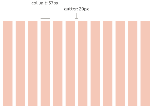 Our existing fixed-width desktop grid.
Inside that grid, content can be divided into one, two, three or four columns. In extreme cases, we can also use five columns, but we avoid this.
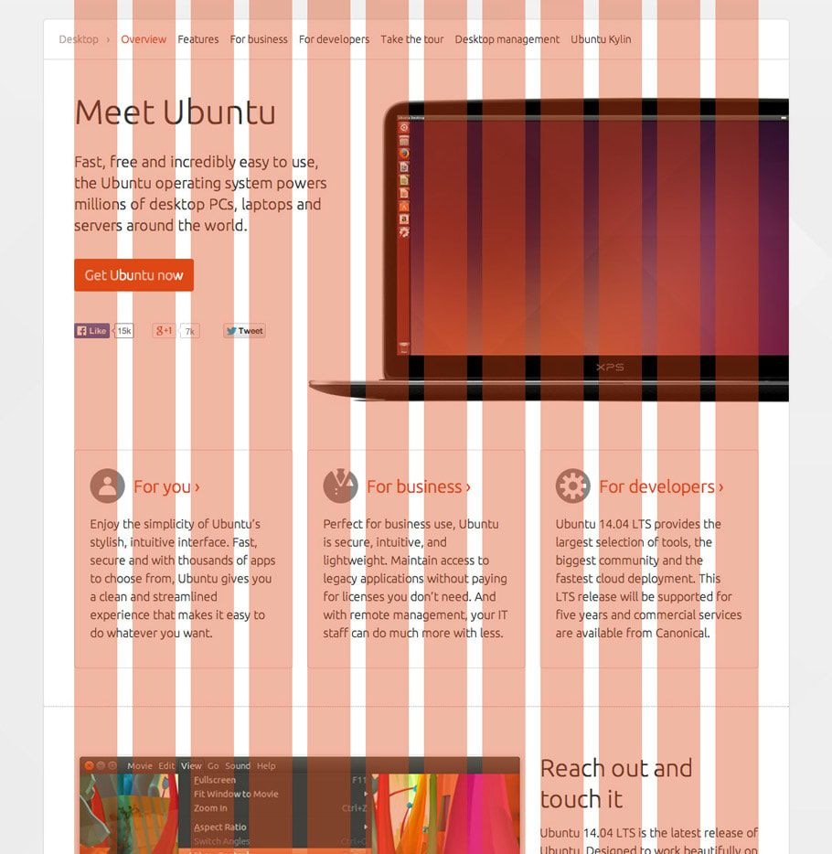 Our grid laid over an existing page of the site.
We also try keeping text content below eight columns, as it becomes harder to read otherwise.
Adding flexibility
When we first created our web style guide, we decided that, since we were getting our hands dirty with the refactoring of the CSS, we’d go ahead and convert our grid to use percentages instead of pixels.
The idea was that it would be useful for the future, while keeping everything looking almost exactly the same, since the content would still be all held within a fixed-width container for the time being.
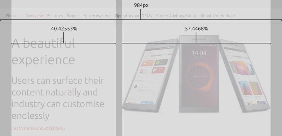 A fixed-width container holding percentage-based columns.
This proved one of the best decisions we made and it made the transition to responsive much smoother than we initially thought.
The CSS
We used Gridinator to initially create our basic grid, removed any unnecessary rules and properties from the CSS it generated and added others we needed.
The settings we’ve input, in case you’re wondering, were:
- Number of columns: 12
- Column width: 57px
- Column margins: 20px (technically, the gutters)
- Container margin: 40px
- Body font size: 16px
- Option: percentage units
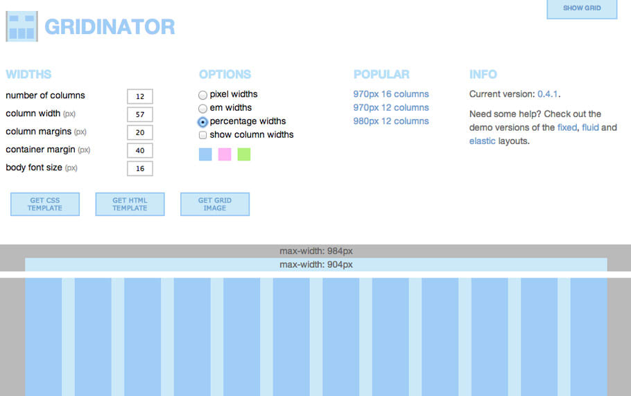 Screenshot of our Gridinator settings.
We could have created this CSS from scratch, but we found this tool saved us some precious time when creating all the variations we needed when using the grid.
You can have a peek into our current grid stylesheet now.
First prototypes
The first two steps we took when creating the initial responsive prototype of ubuntu.com were:
- Remove the fixed-width container and see how the content would flow freely and fluidly
- Remove all the floats and positioning rules from the existing CSS and see how the content would flow in a linear manner, and test this on small screen devices
When we removed the fixed-width container, all the content became fluid. Obviously, there were no media queries behind this, so the content was free to grow to huge sizes, with really long line lengths, and equally the columns could shrink to unreasonably narrow sizes. But it was fluid, and we were happy!
Similarly, when checking the float-free prototype, even though there were quite a few issues with background images and custom, absolutely positioned elements, the results were promising.
 Our first float-free prototype: some issues but overall a good try.
These tests showed to us that, even though the bulk of the work was still ahead of us, a lot had been accomplished by simply making the effort to convert our initial pixel-based columns into percentage based ones. This is a test that we think other teams could be able to do, before moving on to a complete revamp of their CSS.
Defining breakpoints
We didn’t want to relate our breakpoints to specific devices, but it was important that we understood what kind of screen sizes people were using to visit our site on.
To give you an idea, here are the top 10 screen sizes (not window size, mind) between 4 March and 3 April 2014, in pixels, on ubuntu.com:
- 1366 x 768: 26.15%
- 1920 x 1028: 15.4%
- 1280 x 800: 7.98%
- 1280 x 1024: 7.26%
- 1440 x 900: 6.29%
- 1024 x 768: 6.26%
- 1600 x 900: 5.51%
- 1680 x 1050: 4.94%
- 1920 x 1200: 2.73%
- 1024 x 600: 2.12%
The first small screen (360×640) comes up at number 17 in the list, followed by 320×568 and 320×480 at numbers 21 and 22, respectively.
We decided to test the common approach and try breakpoints at:
- Under 768px: small screen styles
- Between 768px and under 986px: medium screen styles
- 986px and up: large screen styles
This worked well for our content and was in line with what we had seen in our analytics numbers.
At the small screen breakpoint we have:
- Reduced typographic scale
- Reduced margins and padding
- Reduced main content container padding
At this scale, following what we had done in Ubuntu Resources (now Ubuntu Insights), we reused the grid from the Ubuntu phone designs, which divides the portrait screen into 40 squares, horizontally.
 The phone grid.
At the medium screen breakpoint we have:
- Increased (from small screen) typographic scale
- Increased margins and padding
- Increased main content container padding
At the large screen break point we have:
- The original typographic scale
- The original margins and padding
- The original main content container padding
 Comparison between small, medium and large screen spacing.
Ideas for the future
In the future, we would like to use more component-specific breakpoints. Some of our design components would work better if they reflowed or resized at different points than the rest of the site, so more granular control over specific elements would be useful. This usually depends on the type and amount of content the component holds.
What about you? We’d love to know how other people have tackled this issue, and what suggestions you have to create flexible and robust grids. Have you used any useful tools or techniques? Let us know in the comments section.
Read the next post in this series: “Making ubuntu.com responsive: adapting our navigation to small screens”
Reading list
Talk to us today
Interested in running Ubuntu in your organisation?
Newsletter signup
Related posts
Why Web Engineering is great
Like many software engineers, one of my first software development experiences started with creating my own web page. Since that time 20+ years ago, a lot has...
From inspiration to impact: design students from Regent’s University London explore open design for their dissertation projects
Last year, we had the opportunity to speak at Regent’s UX Conference (Regent’s University London’s conference to showcase UX work by staff, students, and...
Showcasing open design in action: Loughborough University design students explore open source projects
Last year, we collaborated with two design student teams from Loughborough University in the UK. These students were challenged to work on open source project...