
%27%20fill%3D%27%23E95420%27%3E%3Cpath%20d%3D%27m15.839%205.293-1.447-2.8a.136.136%200%200%200-.051-.055.144.144%200%200%200-.074-.02h-5.8a.143.143%200%200%200-.091.03.13.13%200%200%200-.034.17.138.138%200%200%200%20.072.06l7.251%202.8a.144.144%200%200%200%20.17-.054.13.13%200%200%200%20.007-.13l-.003-.001ZM11.839%204.945.073.223A.073.073%200%200%200%20.026.221a.07.07%200%200%200-.038.027.065.065%200%200%200%20.007.086l7.962%208.182a.069.069%200%200%200%20.049.022.072.072%200%200%200%20.047-.019l3.805-3.461a.066.066%200%200%200%20.02-.061.065.065%200%200%200-.014-.03.07.07%200%200%200-.028-.02l.003-.002ZM5.382%207.183a.071.071%200%200%200-.062-.022.07.07%200%200%200-.03.011.067.067%200%200%200-.023.025l-4.13%207.696a.065.065%200%200%200-.005.046.068.068%200%200%200%20.027.038.072.072%200%200%200%20.09-.006L7.13%209.18a.066.066%200%200%200%200-.087l-1.75-1.91Z%27%2F%3E%3C%2Fg%3E%3Cdefs%3E%3CclipPath%20id%3D%27a%27%3E%3Cpath%20fill%3D%27%23fff%27%20d%3D%27M0%200h15.83v15.21H0z%27%2F%3E%3C%2FclipPath%3E%3C%2Fdefs%3E%3C%2Fsvg%3E)

%27%20fill%3D%27%23E95420%27%3E%3Cpath%20d%3D%27M1.936%202.592c.668%200%201.21-.515%201.21-1.151S2.604.29%201.936.29C1.267.29.726.805.726%201.44c0%20.637.541%201.152%201.21%201.152ZM14.56.576H3.404a1.587%201.587%200%200%201%20.024%201.69l-.026.04h11.156a.56.56%200%200%200%20.386-.15.518.518%200%200%200%20.16-.369v-.692a.502.502%200%200%200-.16-.369.543.543%200%200%200-.386-.15ZM1.936%206.701c.668%200%201.21-.515%201.21-1.15%200-.637-.542-1.152-1.21-1.152-.669%200-1.21.515-1.21%201.151s.541%201.151%201.21%201.151ZM14.56%204.685H3.404a1.612%201.612%200%200%201%20.242%201.083c-.03.215-.105.421-.219.608l-.026.04h11.157a.56.56%200%200%200%20.386-.15.518.518%200%200%200%20.16-.37v-.692a.5.5%200%200%200-.16-.369.542.542%200%200%200-.386-.15ZM1.936%2010.81c.668%200%201.21-.515%201.21-1.15%200-.637-.542-1.152-1.21-1.152-.669%200-1.21.515-1.21%201.151s.541%201.151%201.21%201.151ZM14.56%208.795H3.404a1.611%201.611%200%200%201%20.243%201.082%201.581%201.581%200%200%201-.245.648h11.156a.559.559%200%200%200%20.386-.15.517.517%200%200%200%20.16-.37v-.692a.502.502%200%200%200-.16-.368.543.543%200%200%200-.386-.15ZM1.936%2014.92c.668%200%201.21-.515%201.21-1.15%200-.637-.542-1.152-1.21-1.152-.669%200-1.21.515-1.21%201.151s.541%201.151%201.21%201.151ZM14.56%2012.904H3.404a1.611%201.611%200%200%201%20.242%201.082%201.58%201.58%200%200%201-.219.608l-.026.04h11.157a.562.562%200%200%200%20.386-.15.517.517%200%200%200%20.16-.37v-.692a.5.5%200%200%200-.16-.369.543.543%200%200%200-.386-.15Z%27%2F%3E%3C%2Fg%3E%3Cdefs%3E%3CclipPath%20id%3D%27a%27%3E%3Cpath%20fill%3D%27%23fff%27%20d%3D%27M0%200h15.83v15.21H0z%27%2F%3E%3C%2FclipPath%3E%3C%2Fdefs%3E%3C%2Fsvg%3E)
%27%20fill%3D%27%23E95420%27%3E%3Cpath%20d%3D%27M9.618.272c-.634%200-1.243.243-1.691.674-.448.43-.7%201.015-.701%201.624v4.221a1.9%201.9%200%200%201%201.362%200v-4.22a.955.955%200%200%201%20.291-.72%201.067%201.067%200%200%201%201.479%200%20.955.955%200%200%201%20.29.719v.962h1.363V2.57c0-.61-.253-1.194-.702-1.625A2.445%202.445%200%200%200%209.618.272ZM9.017%208.433c0%20.21-.065.417-.187.593a1.102%201.102%200%200%201-.499.393c-.203.08-.426.102-.642.06a1.125%201.125%200%200%201-.568-.292%201.055%201.055%200%200%201-.304-.547%201.028%201.028%200%200%201%20.064-.616c.084-.195.226-.362.41-.479a1.143%201.143%200%200%201%201.401.133c.103.1.185.217.24.347.057.129.085.268.085.408ZM2.773%205.855c-.634.001-1.242.244-1.69.674C.633%206.96.381%207.545.38%208.154v4.082a1.901%201.901%200%200%201%201.363%200V8.154a.955.955%200%200%201%20.29-.719%201.067%201.067%200%200%201%201.479%200%20.955.955%200%200%201%20.29.719v.962h1.363v-.962c0-.61-.253-1.194-.702-1.625a2.444%202.444%200%200%200-1.69-.674ZM2.166%2013.878c0%20.21-.065.415-.186.59-.121.174-.294.31-.496.39-.202.08-.424.102-.638.06a1.119%201.119%200%200%201-.565-.29%201.049%201.049%200%200%201-.302-.543c-.043-.206-.02-.42.063-.614.084-.194.225-.36.407-.476a1.136%201.136%200%200%201%201.394.133%201.024%201.024%200%200%201%20.323.75Z%27%2F%3E%3Cpath%20d%3D%27M14.752%204.76a1.789%201.789%200%200%201-.681-.126v2.411a.972.972%200%200%201-.312.682c-.193.179-.45.28-.718.28-.268%200-.526-.101-.718-.28a.972.972%200%200%201-.312-.682V4.32h-1.363v2.726c0%20.61.252%201.195.7%201.626a2.443%202.443%200%200%200%201.692.673c.635%200%201.244-.242%201.692-.673.449-.431.7-1.016.7-1.626v-2.41a1.9%201.9%200%200%201-.68.125ZM15.858%202.822c.037.225%200%20.455-.107.658a1.1%201.1%200%200%201-.49.472%201.161%201.161%200%200%201-1.302-.198%201.04%201.04%200%200%201-.206-1.251%201.1%201.1%200%200%201%20.492-.47%201.161%201.161%200%200%201%201.299.199c.166.16.276.366.314.59ZM7.907%2010.2c-.233%200-.465-.042-.681-.126V12.6a.97.97%200%200%201-.302.7%201.05%201.05%200%200%201-.728.29%201.05%201.05%200%200%201-.728-.29.97.97%200%200%201-.302-.7V9.845H3.804V12.6c0%20.61.252%201.194.7%201.625a2.443%202.443%200%200%200%201.692.674c.634%200%201.243-.243%201.692-.674.448-.43.7-1.015.7-1.625v-2.526a1.887%201.887%200%200%201-.68.127Z%27%2F%3E%3C%2Fg%3E%3Cdefs%3E%3CclipPath%20id%3D%27a%27%3E%3Cpath%20fill%3D%27%23fff%27%20d%3D%27M0%200h15.83v15.21H0z%27%2F%3E%3C%2FclipPath%3E%3C%2Fdefs%3E%3C%2Fsvg%3E)

Juju ice-cream icon design

Matthieu James
on 19 November 2013
Tags: Design
Who doesn’t like ice-cream? Here in the design team we sure do! In the last few weeks we’ve been preparing a special Juju demo for the OpenStack Summit in Hong Kong and we’ve created some very ‘tasty’ icons for it. We thought it would be nice to show you how those icons were created, so here’s a little insight on the design process.
The brief
We wanted to replace the normal Juju icons for something a little bit more special in order to explain to people that visited the Ubuntu stand what kind of things Juju can do. We decided to use the idea of an ice-cream with toppings and sauce which you can build in the same way that you can build services in Juju.
The best part of this demo is that people would actually get the ice-cream they had ‘built’ in Juju in real life!
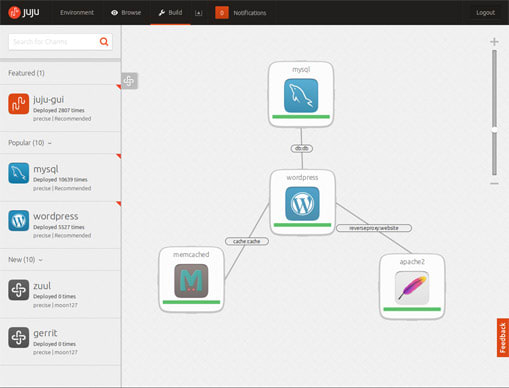 The Juju interface, with its default icons
Finding good concepts
The first thing I needed to do was to find good concepts to present ice-creams and toppings in an icon format. Toppings were going to be especially tricky, as they can be very small and therefore hard to make out at small sizes.
I initially sketched and designed some ideas that were using a kind of flat look. This worked well for the ice-cream, but not so much for the toppings — I soon noticed they had to be semi-realistic to be recognisable.

![]() Initial sketches and designs following a flat and more simplified look
Initial sketches and designs following a flat and more simplified look
At a second stage, I added perspective to the icons; it was important that the icons kept the same perspective for consistency.
 Another set of sketches with added perspective
The shape of the sauce bottles was also something that needed a bit of trial and error. The initial design looked too much like a ketchup bottle, so we’ve decided to try a different approach.
 Before and after shape of the sauce
For the backgrounds, I chose to use vibrant colours for the ice-cream icons, to contrast with the ice-creams’ monochrome palette, but paler colours for the toppings, as these are already quite colourful.
The amount of detail added to the icons is just enough for what we needed to show and for them to be recognised. I’ve also added larger pieces to the side of the toppings, to make them easier to be identified.
 The Oreo topping icon, with a side of Oreos
Working out the detail
The Oreo pieces were created from a single biscuit, which I cut into 9 different parts and then distributed in different layers — I guess in a similar way to what happens in real life.
 The 9 pieces used to create the icon
The clone tool in Inkscape came in handy: repeating the same small set of different pieces made the final SVG file much lighter, and also Inkscape faster.
The whole process took 4 days from brief to final icons, which is quite a tight deadline, but it was a really fun project to work on.
![]() The final icon set
The final icon set
Talk to us today
Interested in running Ubuntu in your organisation?