Designing a product you don’t use
Luca Paulina
on 27 September 2013
Tags: Design
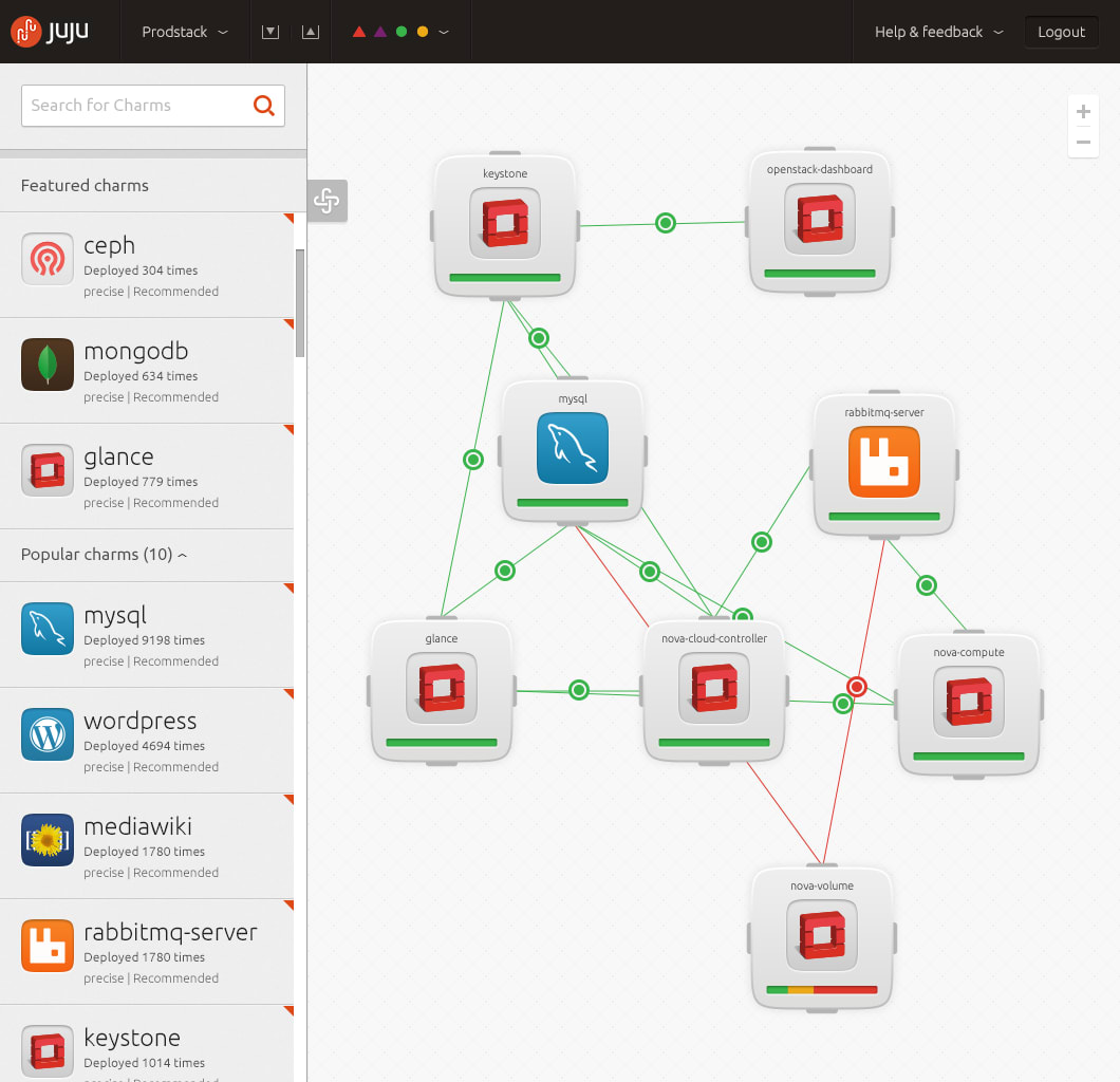
Over the last year we have been working on the Juju GUI to reach a broader audience. Juju is a way of building complex cloud environments. It connects different services, allows complex configuration and the ability to scale out quickly and easily. Juju is offered as a command line tool or as a GUI on the web.
The team
For the last 6 months a small dedicated team has been working together to push the design of the Juju GUI forward. The design team consists of 2 user experience designers, Alejandra and Luca, and 2 visual designers, Jamie and Spencer. The project has raised many questions and one of them was what it is like designing a product you don’t use. In this blog post Jamie and Luca attempt to clarify our process.
No assumptions
Luca: As a user experience designer part of my process is to create assumptions to further thought, design and development, these are later validated in interviews with stakeholders, user testing or with the development team. An assumption is something that is generally accepted as being true without proof. I’ll never be a direct user of Juju, therefore creating assumptions for the type of audience that the Juju GUI is designed for is an interesting challenge.
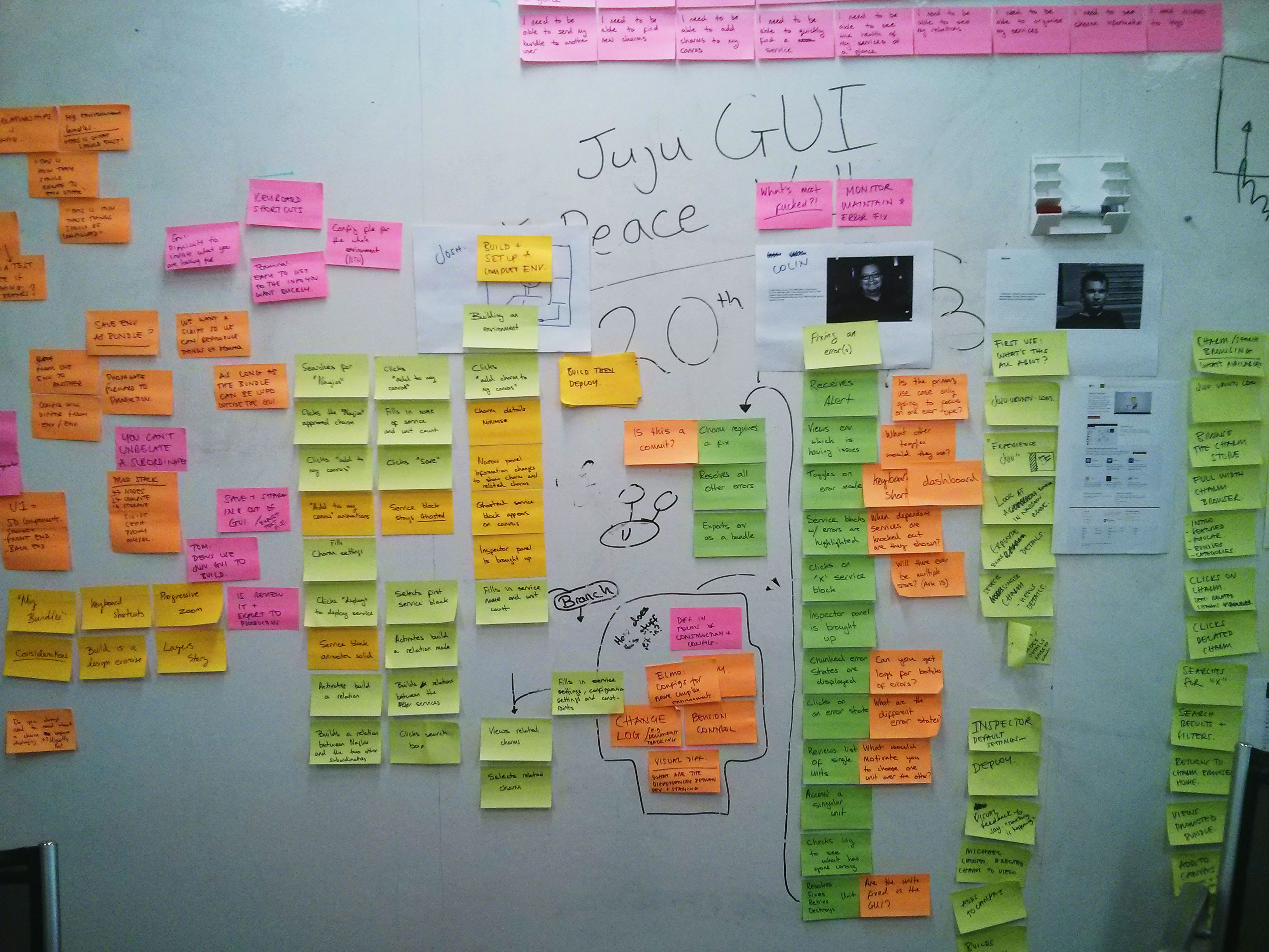
To help build assumptions, ideate and create cohesive user flows that will later be tested I’ve had to run planned and impromptu workshops, ask questions, have daily hangouts with the development team, run week long sprints, ask more questions and lock myself away in the Juju war room to immerse myself in the world of Juju.
Jamie: From a visual perspective this digital product is unlike anything that I’ve worked on in the past. Whereas some rules of typography, hierarchies and readability apply to the design I’ve found myself a lot more focussed on subtle detailing and refinements than ever before. This is because users of the GUI are wanting to complete tasks, they want to be able to deploy their environments as quickly and painlessly as possible. So the design job became about helping them do that without the GUI getting in the way. It is intended to lay lightly across the canvas, aiding users when they need and not obstructing them when they don’t.
 The Juju GUI
Extensive and continuous research
Luca: I’m always surprised by the sheer amount of complexity that the GUI entails. The varying needs of our core target audiences means that we have to conduct a lot of research when we create user flows, ideas and when we’re examining if a feature is needed. Thankfully we have a great user research team which helps find users, conducts the testing and helps interpret the results.
I’ve found that with this particular product the interpretation of feedback has been key to making sure our designs resonate with our users. The feedback is catalogued in a document and shared out amongst the development teams to gain their insights and ideas as well. Solutions are then ideated and the design team then acts upon them creating new designs.
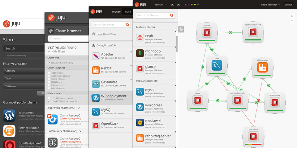
Jamie: The user testing results and feedback from the community has been key to the development of the visual style for the GUI. We’ve been through numerous rounds of testing to get to this stage of design development and each round of tests has moved the design forward. Once a round of testing has been completed the team will review the findings and create design tasks to solve any issues highlighted by the testers. The users we’ve tested with have been high-level cloud architects and system administrators, so familiar with the type of tasks that the GUI performs just not familiar with the way in which we perform those tasks in the GUI. Assumptions we’ve made about the way they would use the GUI have sometimes been mistaken so the design really has been guided by the users.
 Evolution of Juju’s interface
Constant validation from a multidisciplinary team
Luca: Throughout the project the need for validation on concepts and ideas has been incredibly important. The agile process we use allows us to create wireframes and designs quickly and get them in front the dev team and get their insight and feedback, we’re lucky enough to have a near 24 hour working cycle (Teams in Europe, North America and Australasia). Because of this it’s not uncommon for a design to go through many iterations in a week, for example; the inspector wireframes (pictured below) went through 9 revisions in 10 working days, the complexity of the inspector design and experience was refined and finessed collaboratively with the development team, this has turned the inspector into an integral and very powerful part of the GUI.
 Detailed wireframes for the inspector
Jamie: Working within an agile process has meant that design decisions are required to be made quickly and collaboratively within the team. The design team in London is small so we can share work internally and move designs on sometimes multiple times a day. This means we’re able to keep up with the development cycle that releases every 2 weeks and means that users can see the design evolve far faster than waiting for a yearly or biannual release of the product. As a designer it’s been hard seeing the product not pixel perfect when it’s released but we’re working hard to craft, fine-tune and round the edges of it so it will be a beautiful thing to use and interact with each new release.
 Visual iterations of the inspector
Questioning language and terminology
Luca: Juju is expanding into a new field of creating clouds by managing services not machines. This means that there really isn’t a language framework that we can rely on and one thing that has been apparent over the last 6 months is the importance of terminology and language for developers. At the beginning of the project it was difficult and time consuming to learn the established vocabulary associated with the cloud and Juju, this gave us a great reason to start questioning words and terms used throughout the GUI. We uncovered words that were already established in other web services and words that didn’t connect with the user. Questioning these words and terms made it clear that not only do we (as non-users) not understand but this would also happen with users and it allowed us to finesse the language in the GUI to something more appropriate.
Good design principles and patterns
Jamie: The GUI is not just the work of the Cloud team. To harmonize the look of the products in the Canonical stable we’ve worked closely with the design team developing the phone OS looking for ways that design patterns developed by them can be applied to the Juju GUI. We’ve also worked with the Web team to see where we can integrate any elements from their UI library. The GUI is a product but it’s not a mobile OS and equally we interact with it in a desktop web browser but it’s not a website, so it ultimately has to have it’s own look. But by pooling the collective design wisdom of the teams who have been crafting interactions in their specific fields and by using patterns and guidelines already defined in this space we can create a interface that is better than the sum these parts but with it’s own clear voice.
Good design practices
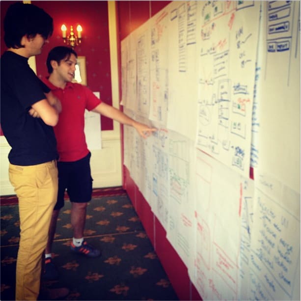
Jamie: We like to sketch here. We sketch everything out before any work is done on screen and it’s enormously useful in iterating quickly through problems that users have and trying to come up with multiple solutions to these in a collaborative way. With a small team we can sketch our way through multiple problems towards multiple solutions and then move into applications like Photoshop and Illustrator once we’ve got a clear direction of the UX. This fast way of working also allows us to keep pace with the development cycle and to be able to add features to the GUI each time we do a release. Once a feature of the GUI is open to the world we’ll gather feedback then it’s back to the drawing board to refine it.
 UX sketching during a recent sprint
Playing to our strengths
Luca: Most of the processes to provision, create and manage services in the cloud are currently carried out via command line. A priority for us has been to think about how we can use visual language to provide a layer of information and understanding not readily available via the command line. As designers we understand that with colour, structure, layout and flow we can communicate the status of a system or process in a very powerful way. We have made it our goal to bring out the strengths of the GUI by exploring visual metaphors and relationships. We established that the command line is an input output tool, the GUI doesn’t have that type of interaction and offers a more holistic approach, we offer that by having a clear hierarchy and having concise user flows. Early on in the project we made a principle to not compete with the command line but to embrace it, there are users out there who will use Juju just as a command line tool or as the GUI or a mix of both.
![]() Playful icons helps users navigate the GUI
Playful icons helps users navigate the GUI
Final thoughts
Pretty much everyone in the team has been involved in the conceptual stage of the project, this has helped us create a cohesive product with some really powerful features. I’m sure there are a lot of designers out there working on designs for products that they won’t end up using. We wanted to take the time to highlight how we’ve approached this problem while we’ve been working on the Juju GUI project. The coming months will see a redesign of the the navigation bar, notifications, service blocks and relationship lines. We’ve given you a preview of some of these features in the visuals above.
Talk to us today
Interested in running Ubuntu in your organisation?
Newsletter signup
Related posts
How we ran a sprint to refresh our design website, Part 2
Part 2 of our series on how our team created content for our design website. Get insights, tools, and lessons to help you run your own design sprint.
In pursuit of quality: UX for documentation authors
Canonical’s Platform Engineering team has been hard at work crafting documentation in Rockcraft and Charmcraft around native support for web app frameworks...
Improving our web page creation workflow: how structured content is slashing design and development time
Co-authored with Julie Muzina A year ago, during our Madrid Engineering Sprint, we challenged ourselves to dramatically reduce, or even eliminate, the need...

