
Design and Web team summary – 2 July 2021

Peter Mahnke
on 8 July 2021
Tags: Design
The web team at Canonical runs two-week iterations building and maintaining all of Canonical websites and product web interfaces. Here are some of the highlights of our completed work from this iteration.
Web
The Web team develops and maintains most of Canonical’s sites like ubuntu.com, canonical.com and more.
Security certification docs
If you were not aware by now the team has been working to migrate all user-facing documentation to our discourse content model. As we are near completion of all docs, we worked on Security certification docs this iteration. Which loads its content from our Security Certification category on discourse.
Visit the Ubuntu security certification documentation

Brand
The Brand team develop our design strategy and create the look and feel for the company across many touch-points, from web, documents, exhibitions, logos and video.
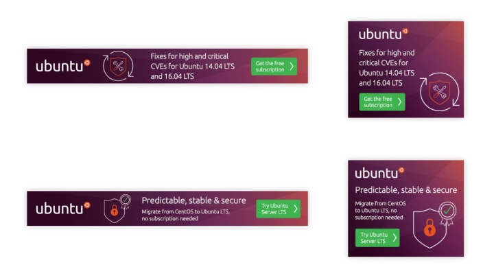
Google Cloud social banners
Working with the Marketing team we developed a number of jointly branded social media Ads to promote the use of Ubuntu Pro for Google Cloud.

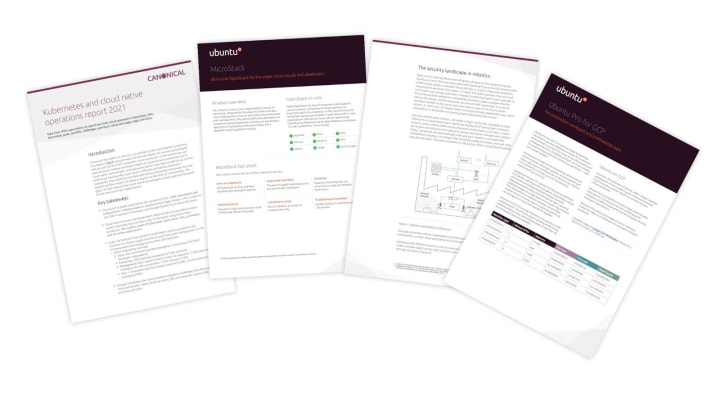
Marketing documents
A group of documents were created in this iteration for use by the Marketing and Project Management teams, including case studies, whitepapers and datasheets.
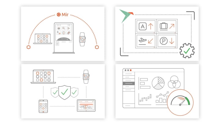
Mir illustrations
Four illustrations were created for the Mir team to be used in the upcoming refresh of the Mir website.
StackOverflow banners
We created some social media banners to be used on StackOverflow with the aim of promoting Ubuntu Server and Ubuntu LTS.
Vanilla
The Vanilla team designs and maintains the design system and Vanilla framework library. They ensure a consistent style throughout web assets.
New in Vanilla v2.32.0
Deprecated the neutral button
We deprecated the .p-button–neutral class, as it was identical to the default .p-button variant of the component, which should now be used instead.
Introduced theming for buttons
Buttons now have light and dark themes. The light theme is used by default, but it’s possible to change that default to dark, and also to switch between dark and light themes by adding the appropriate .is-dark/.is-light utility class on individual buttons:


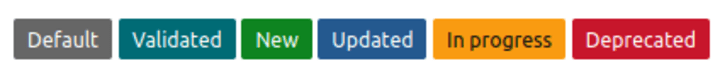
Updates to labels component
We updated our internally used label component, and added a default .p-label variant to it alongside several existing flavours, which can be used to indicate status, be displayed as tags, or other useful information:
Utility class for tables
By default, Vanilla tables hide any content that would overflow from the cell. The newly added .has-overflow class allows the content of a cell to spill out over the cell. This is particularly useful when the cell contains a contextual menu that drops down a set of actions.

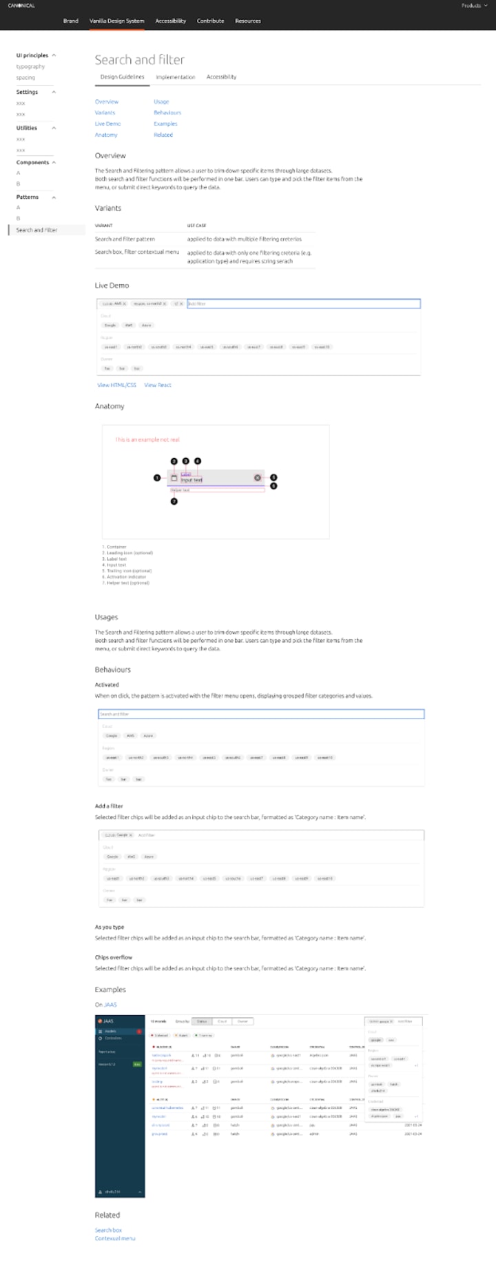
New design system website – Component / Pattern page redesign
The first MVP feature we worked on for the new site is to redesign the component / pattern page. As a key part of the design system, we want to allow all users in different roles to access the information they require. By splitting each component page into three tabs – Design guidelines, implementation and accessibility, we provide better categorisation of the information.
Audit and review of the use of spacing in Vanilla

Internally, the spacing within and between Vanilla components is controlled by a set of variables that aim to keep similar elements spaced consistently. It is an elaborate system that hasn’t been well documented, so as a first step towards full documentation, this iteration we completed a visual audit. We also identified and fixed a few cases of incorrect usage.
Apps
The Apps team develops the UI for the MAAS project and the JAAS dashboard for the Juju project.
React migration sprint clean-up
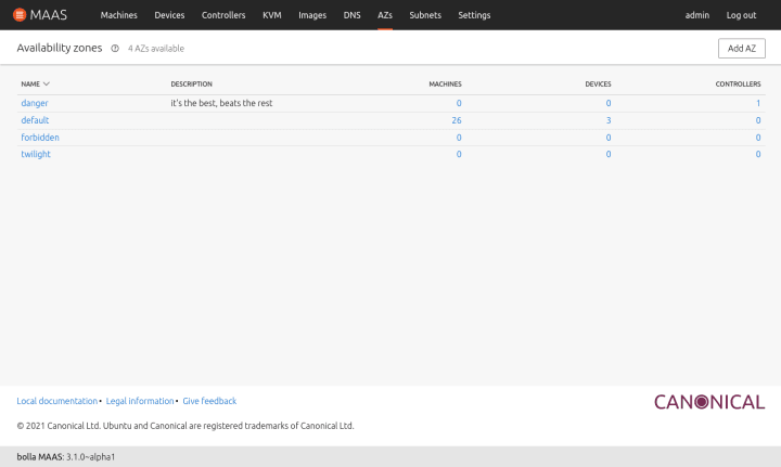
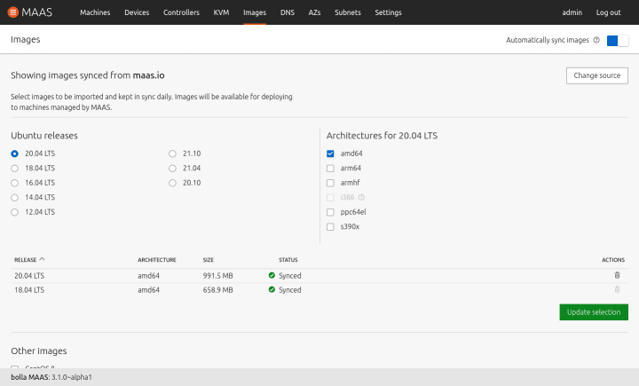
Continuing from the migration sprint from the previous iteration, we cleaned up some of the finished sections and finalised some of the unfinished sections. This meant cleaning up and refactoring our code to the right convention and aligning the UI components with the rest of the React app. As far as the progress goes, our dashboard, DNS, and Availability Zones pages have been fully migrated. The Images page is also now about 90% complete.
Dashboard

Domains

Zones
Images
Machine cloning
In this two week iteration, we focused on exposing the cloning API to the UI, where we want to allow MAAS users to clone network and/or storage configurations from a source machine to multiple destination machines. We worked through a few explorations of interaction design to figure out how this could fit with the current workflow. Here is our first prototype of the new cloning UI, if you want to try it out.
The overall flow starts at selecting destination machines. When a user selects multiple machines, they have an option to clone the networking and/or the storage configurations from a source machine into the selected destination machines.
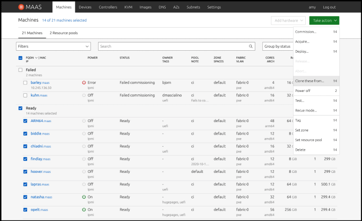
In this workflow, we assume that our users would already know which source machine they want to clone from and that cloning will work with a homogeneous hardware environment.

You can either clone the storage or network configuration from the source machine to the destination machine or both! Since our assumption is that you would already have an idea of which source machine you want to clone from, the search function allows you to search by hostname or system id.
To be able to successfully clone machines, the source and destination machines need to be in one of the following states: failed testing, allocated, or ready. In addition, the user needs to have admin permission on all machines that the cloning will be performed on.

Once the source machine is selected from the drop-down list, you will see a brief summary of the source machine, including the network and storage information.
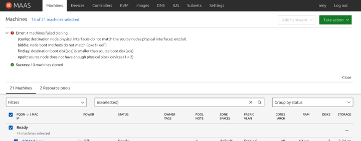
Once the cloning process is complete, we will report the number of successful machines and error machines, allowing you to either select other machines to clone or inform why the cloning process failed.
One of the more common mistakes is to clone machines with different disk sizes. In our current API, if the destination machine has a smaller disk size than the source machine, cloning will not be successful. The same mental model goes for block devices as well. Other errors that can occur includes, selecting machines with unmatched boot methods and unmatching networking interfaces.
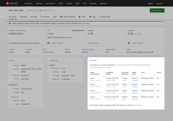
Showing IP addresses in the UI network card
We received a bug report that the IP address should be surfaced to the network summary card because it is one of the most important pieces of information regarding the Network tab of a machine in MAAS. However, we were not showing that information in the network card in the Summary section.
Although it looked like the IP address was way more relevant than the MAC address, MAC address and DHCP were very important in an enterprise-level MAAS and cannot be eliminated from the Network card and we cannot disregard that, especially, for debugging purposes.
With that in mind, we initially looked for a way to switch between both of them, MAC addresses and IP addresses, since space matters in this kind of card.
The final decision, nonetheless, was to show both. In addition, we took this opportunity to enrich the table and include more information from the Network tab, like subnet and VLAN.

Marketplace
The Marketplace team works closely with the Store team to develop and maintain the Snap Store site and the upcoming Charmhub site.
Kubernetes and cloud native operations report 2021
We recently ran a survey about Kubernetes and the cloud. Almost 1200 people have responded to it so far.
We build a report to show the results, insights and commentary from industry experts.

List collaborations for Charmhub publishers
Charmhub publishers will now be able to see and modify charms or bundles when they are a collaborator of that package.

Store reviewer research
We have been doing a series of interviews to discover more in-depth the role of a reviewer in a store, as part of our work to migrate the reviewer pages from dashboard.snapcraft.io to snapcraft.io. As an initial summary of our discoveries, we built a user flow that details the process reviewers have to go through when a manual review is needed, including some of the most common pain points of their flow. This will be the basis of the future migration and improvements to the functionality later in this cycle.

With ♥ from Canonical web team.
Talk to us today
Interested in running Ubuntu in your organisation?
Newsletter signup
Related posts
How we ran a sprint to refresh our design website, Part 2
Part 2 of our series on how our team created content for our design website. Get insights, tools, and lessons to help you run your own design sprint.
In pursuit of quality: UX for documentation authors
Canonical’s Platform Engineering team has been hard at work crafting documentation in Rockcraft and Charmcraft around native support for web app frameworks...
Improving our web page creation workflow: how structured content is slashing design and development time
Co-authored with Julie Muzina A year ago, during our Madrid Engineering Sprint, we challenged ourselves to dramatically reduce, or even eliminate, the need...