
Colour palette updates

Rae Shambrook
on 20 May 2016
Tags: Design
Over the past few months, we’ve given you a peek into our evolving Suru design language with our wallpaper, convergence and Clock App blog posts.
Suru is based on Japanese aesthetics: minimalism, lightness and fluidity. This is why you will see the platform moving to a cleaner and more modern look.
Naturally, part of this evolution is colour. The new palette features a lightened set of colours with clearly defined usage to create better visual hierarchy and an improved aesthetic sense of visual harmony.
On the technical side, SDK colour handling has been improved so that in the future colour usage will be more consistent and less prone to bugs.
The new palette has also expanded in scope with more colours to enable the creation of designs with greater depth, particularly as we move towards convergence, and reflects the design values we wish to impart onto the platform.
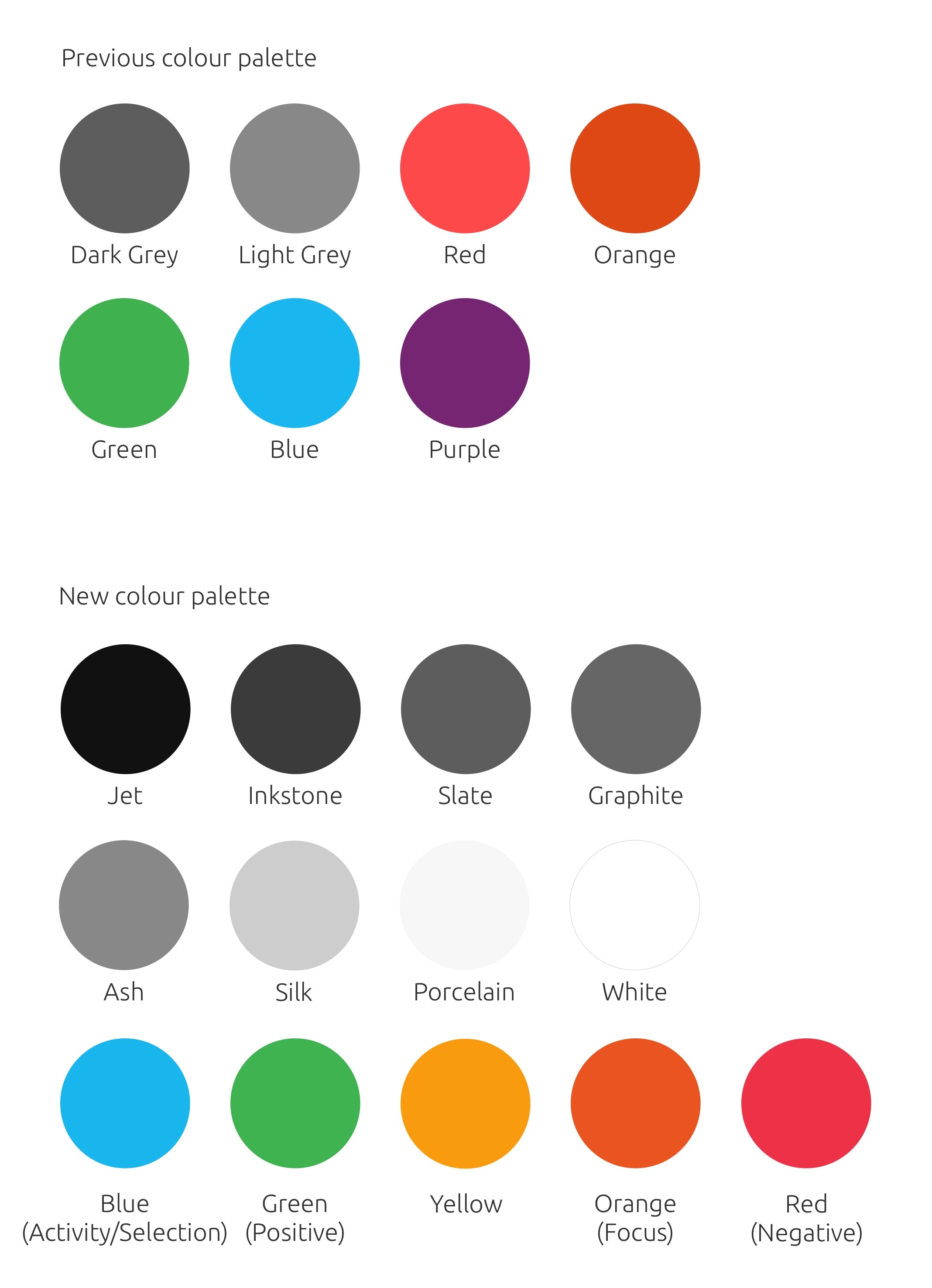
The new palette
Like our SDK, the colour palette has to be scalable. As we worked on visual designs for both apps and the shell, we found that having a colour palette which only contained six colours was too limiting. When approaching elements like the indicators or even shadows in the task switcher, light grey and dark grey weren’t going to be deep enough to stand out on a windowed view, where you have wallpaper and other windows to compete with.
The new palette is made up of thirteen colours. Some noticeable differences are an overall lighter look and additional greys. Purple is gone and we’ve added a yellow to the palette. This broader palette works to solve bugs where contrast and visibility were an issue, especially with the dark theme.
How we came to choose the colours was by iteratively reworking the visual designs across the whole platform and discovering what was needed as we designed. The greys came about when we worked on the revamped dark theme and shell projects, for example the upcoming contextual menus. While we added several new greys, the UI itself has taken on a less grey look.
App backgrounds have been upped to white, the grey neutral button has been lightened to Porcelain (a very light grey) in order to keep the button from looking disabled. These changes were made to improve visibility and contrast, to lighten the palette across the board and to keep everything consistent.
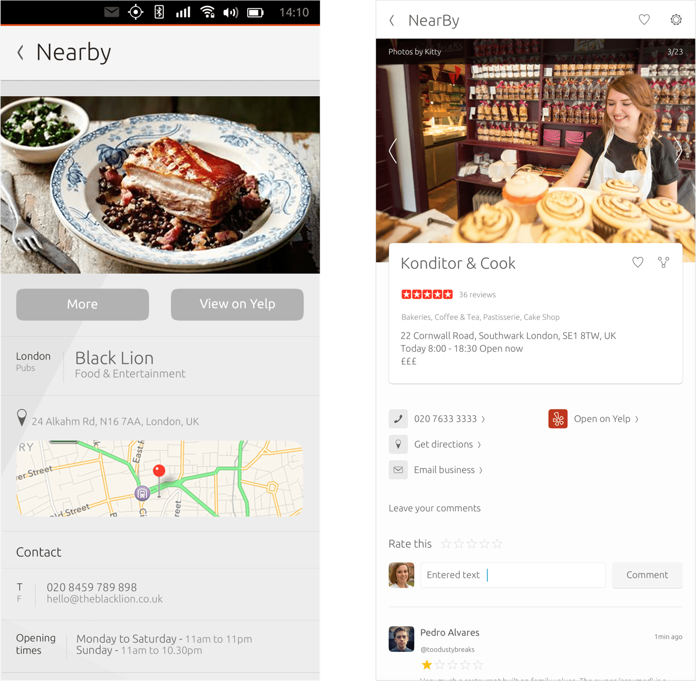
The previous design of the Nearby scope (left) and the updated design using the new palette (right) The background is lighter, buttons don’t look as disabled and text is higher contrast against the background.
The new palette allows developers to have more flexibility as the theme is now dynamic, rather than the colours being hard-coded to the UI as they were previously. In fact, our palette theme is built upon a layering system for which you can find the tutorial here.
Changing the use of orange
Previously orange was liberally used throughout our SDK, however such wide-ranging use of orange caused a number of UX issues:
- Orange is so close to red that, at a glance, components could be misconstrued to be in an error state when in fact their current state was nominal.
- Because orange is so close to red, the frequent use of orange made it harder for users to pick out actual error states in the UI.
- Orange attracts the eye to wherever it is used, but frequently these elements didn’t warrant such a high level of visibility.
Around the same time as these issues were identified, we were also working on the design of focus states for keyboard navigation.
A focus state needs to be instantly visible so that a user can effortlessly see which item is focused without having to pause, look harder, and think.
After exploring a wide range of different concepts, we settled on using an orange frame as our keyboard navigation focus state. However the use of this frame only worked if orange in all other areas was significantly toned down.
In order to fix the UX issues with the overuse of orange and to enable the use of an orange frame as our keyboard navigation focus state, the decision was made to be much more selective as to where and when orange should be applied. The use of orange should now be limited to a single hero item per surface in addition to its use as our keyboard focus state.
This change has:
- Improved visual hierarchy
- Made error states instantly recognisable
- Enabled the use of an orange frame as the keyboard navigation focus state
Usage of blue
For many years blue has been used in Ubuntu to alert the user to activities that are neutral (neither positive or negative). Examples include the Launcher pips changing to blue to give the user a persistent notification of an app alert, or the messaging menu indicator changing to blue to indicate unread messages.
Previously in some (but not all) cases orange was being used to represent select and activity states but effective keyboard navigation had not yet been designed for Unity.
As part of our work on focus states, we also needed to consider a consistent visual language for select states, with a key requirement being that an item could be both focused and selected at the same time.
After much research, experimentation and testing, blue was chosen as the Ubuntu selected state colour. Blue has also returned to being used for natural activity, for example in progress bars. The use of blue for selected and other activity states works with almost all other elements, on both dark and light backgrounds, and stands out clearly and precisely when used in combination with a focus state.
Now that our usage of colour is more precisely and consistently defined (with orange = focus, blue = selected and neutral activity), you will see use of orange minimised so that it stands out as a focus state and more blue to replace orange’s previous selection and activity use.

The sections headers now use blue to indicate which section is selected. This works well with the new focus frame that can be present when keyboard navigation is active.
The future for the palette
Colour is important for aesthetics (the palette needs to visually work together) but it also needs to convey meaning. Therefore a semantic approach is critical for maximum usability. Some colours have cultural meanings, other colours have meanings applied by their context.
By extending the colours in our palette and organising them in a semantic way, we have created a stable framework of colour that developers can use to build their apps without time consuming and unnecessary work. We can now be confident that our Suru design values are being consistently applied to every colour related design problem as we move forward with designing and building convergence.
Talk to us today
Interested in running Ubuntu in your organisation?
Newsletter signup
Related posts
Why Web Engineering is great
Like many software engineers, one of my first software development experiences started with creating my own web page. Since that time 20+ years ago, a lot has...
From inspiration to impact: design students from Regent’s University London explore open design for their dissertation projects
Last year, we had the opportunity to speak at Regent’s UX Conference (Regent’s University London’s conference to showcase UX work by staff, students, and...
Showcasing open design in action: Loughborough University design students explore open source projects
Last year, we collaborated with two design student teams from Loughborough University in the UK. These students were challenged to work on open source project...