
Redesigning ubuntu.com’s navigation

Inayaili de León Persson
on 21 April 2016
Tags: Design
Last month, the web team had an offsite (outside of the office) week sprint in Holborn, central London. We don’t all work on exactly the same projects in our day-to-day, so it’s nice to have this type of sprint, where everyone can work together and show each other what we’ve been working on over the last few months.
 The web team in our offsite in Holborn
One of the key items in the agenda for the week was to brainstorm possible solutions for the key areas we want to improve in our navigation.
The last time we did a major redesign of ubuntu.com’s navigation was back in 2013 — time flies! So we thought now would be a good time to explore ways to improve how users navigate Ubuntu’s main website and how they discover other sites in the Ubuntu ecosystem.
Collaborative sketching
On the second day of the sprint, Francesca walked us through the current version of the navigation and explained the four key issues we want to solve. For each of the issues, she also showed how other sites solve similar problems.
While the 2013 navigation redesign solved some of the problems we were facing at the time (poor exposure of our breadth of products was a big issue, for instance) other issues have emerged since then that we’ve been meaning to address for a while.
After Francesca’s intro, we broke into four groups, and each group sketched a solution for each of the issues, which was then presented to everyone so we could discuss.
 Discussing the team’s sketches
By having everyone in the team, from UX and visual designers, to developers and project managers, contribute ideas and sketch together, we were able to generate lots of ideas in a very short amount of time. We could move the project forward much more quickly than if one UX or one designer had to come up with ideas by themselves over days or weeks.
Improving the global navigation
 ubuntu.com’s global navigation bar
The main things to improve on the global navigation were:
- Some users don’t see the light grey bar above the main orange navigation
- Some users think the links in the global nav are part of the ubuntu.com site
- Important sites sit under the “More” link and do not have enough visibility
- On the new full width sections, the global nav, main nav and “breadcrumb” form a visual sandwich effect that could create confusion
It was interesting to see the different groups come up similar ideas on how to improve the usability of the global navigation. Some of the suggestions were more simple and others more involved.
The main suggestions for improvement that we discussed were:
- Rename the “More” link as “More sites” to make it more clear
- Increase the number of links shown by default by using the full width of the page
- Explore using different colours for the background, such as a dark grey
- Explore having a drawer that exposes all Ubuntu sites, instead of the links being on display all the time (like the Bloomberg website)

 On Bloomberg.com when you click the “Bloomberg the Company & Its Products” link at the top (above) you open a large drawer that exposes the Bloomberg universe of sites.
Improving the main navigation
 ubuntu.com’s main navigation with a dropdown that lists second level links
The main ubuntu.com nav is possibly the most crucial part of the navigation that we would like to improve. The key improvements we’d like to work on are:
- Having the ability to highlight key sections or featured content
- Rely less on the site’s IA to structure the navigation as it makes it hard to cross-link between different sections (some pages are relevant to more than one section)
- Improve the visibility of content that lives in the third level (it is currently only accessible via the breadcrumb-style navigation)
Even though the proposed solutions were different from each other, there were some patterns that popped up more than once amongst the different groups:
- Featured content within the navigation (eg. the original Boston Globe responsive redesign, and Amazon.co.uk)
- Links that live in more than one place (eg. John Lewis, Marks & Spencer and other retailers)
- The idea of using the mega menu pattern
 In the first version of the Boston Globe’s redesigned website, the main navigation included simple featured content for each of the sections

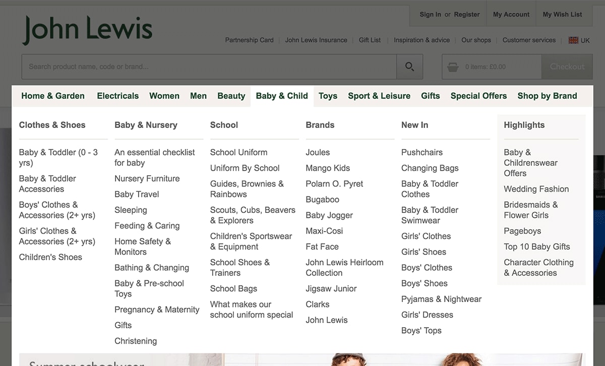 On the John Lewis website, you can get to nursery furniture from “Home & Garden > Room” and “Baby & Child > Baby & Nursery”
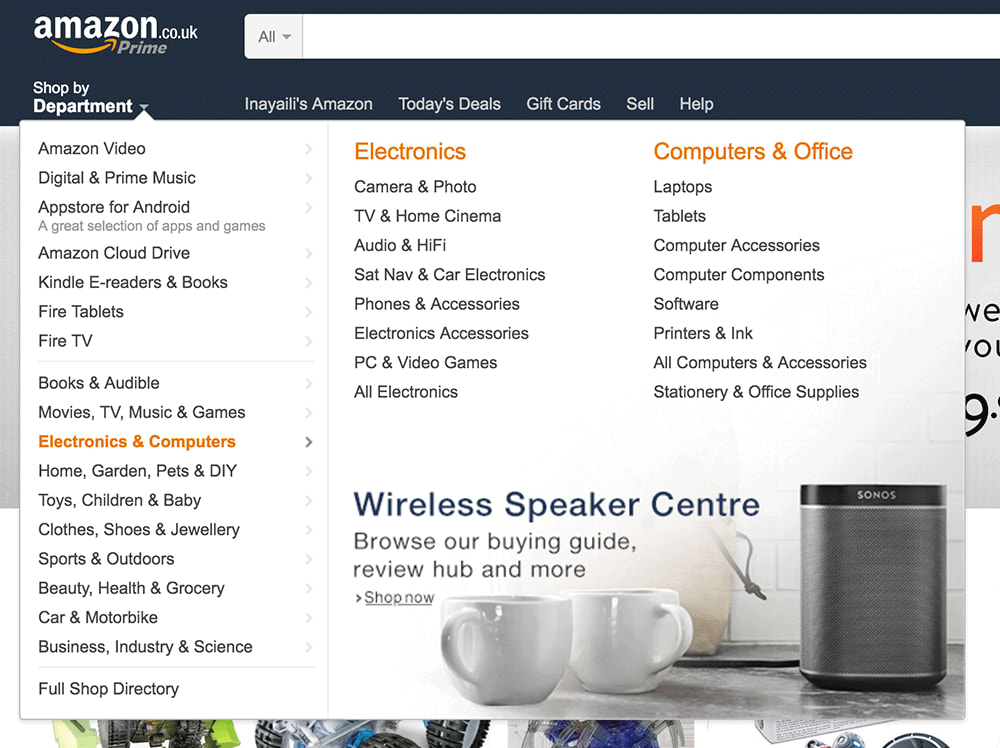 The main navigation on Amazon.co.uk includes featured ads
Solving the third level links issues
 ubuntu.com’s breadcrumb-style navigation showing third level links
The main issues with the current third level links are:
- We are using a recognisable design pattern (the breadcrumb) in a not so typical way (as second and third level navigation)
- When you click on a third level link, you lose the visibility of the second level links, making it harder to understand where you are in the site
- The pattern isn’t flexible: some of our labels are long, and only a small number of links fit horizontally, even on a large screen
One thing that we are almost certain of is that we will not be able to remove third level links completely from our site, so we need to improve the way we show them.
The most interesting suggestions on how to handle this issue were:
- Include a table of contents for the section at the top of pages (like GOV.uk)
- Key third level links could be highlighted in the main navigation menu
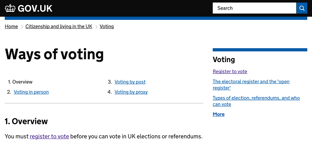 On GOV.uk, sections which have sub-sections include an overview of all the sub-sections at the top of every page. This makes it easier to understand the type and breadth of content of that section
Improving the footer
 ubuntu.com’s “fat footer” with three levels of links
Ubuntu.com’s footer is certainly the simplest of the problems we want to solve in terms of navigation. But, nonetheless, there are some issues with the current solution:
- There are too many levels of links in the footer
- The download section is hidden in the second footer level, despite being one of the main top level links
The most popular idea that came out of the sketching session was to use the space available better, so that sections can be listed in a masonry type grid, rather than one per column like they currently are.
This means we’d need fewer columns to list all important content and expose the IA of the site. It also means we can ditch the middle level of the current footer design (which now holds the About, Support and Download sections).
Next steps
The next step in the navigation redesign project is to build prototypes to test some of the ideas we had in our workshop, and refine the visual direction. We want to see if the assumptions we’ve made are true, and if the patterns are easy and intuitive to use across different screen sizes and devices.
We will then do some user testing and iterate based on the feedback we get.
We might also have to do some IA work alongside the redesign of the main navigation, if we do want to have links that are listed in different sections and if we want to present more curated links based on user tasks in each of the sections.
Stay tuned!
Talk to us today
Interested in running Ubuntu in your organisation?
Newsletter signup
Related posts
From inspiration to impact: design students from Regent’s University London explore open design for their dissertation projects
Last year, we had the opportunity to speak at Regent’s UX Conference (Regent’s University London’s conference to showcase UX work by staff, students, and...
Showcasing open design in action: Loughborough University design students explore open source projects
Last year, we collaborated with two design student teams from Loughborough University in the UK. These students were challenged to work on open source project...
Design and Documentation clinics at FOSDEM Fringe 2026
FOSDEM is one of the biggest and most exciting open source events of the year, held at the Solbosch campus of the Université Libre de Bruxelles (Brussels),...