
Making ubuntu.com responsive: setting the rules (2)

Inayaili de León Persson
on 17 March 2014
Tags: Design
This post is part of the series ‘Making ubuntu.com responsive‘.
The front end framework that powers www.ubuntu.com represents the visual evolution of the site over the past few years: designs have become cleaner, lighter and more open. It was designed without responsiveness in mind, but it has proven flexible, robust and great for our needs: user experience designers can quickly create wireframes for new and updated pages based on existing patterns and developers can create new pages that look good with little input from designers.
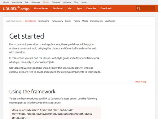 Web style guide front page.
Even though the framework uses a fixed-width container to wrap the content, the containers within it were built to percentages, which means that if that surrounding container were to be removed, the site would become fluid.
 One page of the current site without a wrapping container.
We didn’t want to lose the work that has been put into this style guide. After a long discussion, we agreed that even though we were going to convert the CSS powering the site into mobile-first — so the media queries would be added for larger screen sizes instead of the other way around —, we were going to keep the desktop version as it was initially defined in the style guide.
This is likely a restriction that many other teams share: where there is a will and need to make an existing site responsive, but no budget and/or resources to start from scratch.
We decided that it would be a good idea if our developers, Anthony, Graham, and Karl, could sit in a room for a few days and create a ‘quick and dirty’ prototype of what our current site, using the current styles, would look like in a responsive world.
The main goals of this exercise were:
- To see how disastrous, or indeed how well, the style guide would play when a handful of responsive guidelines were applied
- To give the developers a better understanding of the effort required and issues involved in converting the existing stylesheets into a mobile-first, responsive format
We created a Google doc, structured in the same way as our style guide, where we laid out some rules that would get the developers started on the prototype.
The document started with the more broad and general rules:
- Try to create breakpoints that fit our content, instead of just random device-specific sizes
- Try to keep breakpoints to a minimum, with fluid designs in between each breakpoint
We then laid out some scaffolding (layout and grid) rules:
- Content that is divided in half or thirds should convert into single column when it becomes too narrow
- If the content is divided into quarters, there might be a step in the middle (halfs)
- In rows that include an image to the left or right of the text, the image should move above or below the text, respectively
- Hero images might need to be looked at individually rather than a single rule for all
- Experiment reducing padding inside rows and boxes incrementally as the screen size decreases
- Remove column dividers at smaller screen sizes
We then moved on to forms rules:
- Our forms are already quite vertical, at this stage, make sure we are using correct HTML5 input types
And tables rules:
- Explore solution similar to Wikipedia
And finally JavaScript rules:
- No forcing of equal-height boxes
- Make tabbed content into expanding/collapsing accordion widgets
Many of our styles didn’t need changing at this stage and this was all written down in the doc too.
We also knew that, at this point, we couldn’t look into trickier problems such as the navigation, the typographic scale or how our multiple footers would play in a small screen, so we decided to leave this for later.
Navigation and multiple footers were too complex an issue to be solved at this early stage.
Now it was time for the developers, with this doc in hand, to take a first go at making www.ubuntu.com responsive!
Read the next post in this series: “Making ubuntu.com responsive: making the rules a reality”
Reading list
Talk to us today
Interested in running Ubuntu in your organisation?
Newsletter signup
Related posts
From inspiration to impact: design students from Regent’s University London explore open design for their dissertation projects
Last year, we had the opportunity to speak at Regent’s UX Conference (Regent’s University London’s conference to showcase UX work by staff, students, and...
Showcasing open design in action: Loughborough University design students explore open source projects
Last year, we collaborated with two design student teams from Loughborough University in the UK. These students were challenged to work on open source project...
Design and Documentation clinics at FOSDEM Fringe 2026
FOSDEM is one of the biggest and most exciting open source events of the year, held at the Solbosch campus of the Université Libre de Bruxelles (Brussels),...