Design and Web team summary – 8 February 2021
Anthony Dillon
on 8 February 2021
Tags: Design
The web team at Canonical run two-week iterations building and maintaining all of Canonical websites and product web interfaces. Here are some of the highlights of our completed work from this iteration.
Web squad
The Web Squad develops and maintains most of Canonical’s sites like ubuntu.com, canonical.com and more.
CVE table updates
We have improved the UX of the CVE table on ubuntu.com. We are always looking for ways to give users the best web experience possible, and we found a way to optimise how the CVE data gets displayed in each table cell by extracting repetitive information in a separate column and reducing some of the white space.
ubuntu.com takeover enhancements
We previously had a hard dependency on Discourse API. In this iteration, we removed that hard dependency and improved the visual transition of our homepage takeovers, while still keeping them on discourse.ubuntu.com, so that everyone can contribute changes on this content.
Ubuntu Core docs moved to discourse and ubuntu.com
Together with the release of UC20, we also published Ubuntu Core docs on http://ubuntu.com/core/docs. This was previously hosted on https://core.docs.ubuntu.com/en/, which still will be available for some time until the Core team is able to update all our Ubuntu Core documentation.
Brand
The Brand team develops our design strategy and creates the look and feel for the company across many touch-points, from web, documents, exhibitions, logos and video.
Taipei office redesign
We began working with our appointed architects on the branding of our new Taipei office, to keep it consistent with our other global offices.


Brand hierarchy
Following our meeting on the brand hierarchy, we collated all of the feedback and worked on a roadmap of projects to move forward with.

Multipass illustrations
A number of illustrations were produced for the updated Multipass website.

Multipass status bar icon
Fixing an issue with the legibility of the Multipass icon in the iOS status bar, we created a number of variations to be implemented by the Multipass team.


Ubuntu Core illustrations and animations
Supporting the launch of Ubuntu Core 20, we produced a number of illustrations and worked on an animation to be used in the updated marketing pages.


MAAS
The MAAS squad develops the UI for the MAAS project.
Machine Instances view migrated to React
As part of the rolling migration of the entire MAAS UI from angular.js to React. We have converted the Instances view to React. Getting us one step closer to our goal of migrating the entire Machine details section to React by the end of the cycle in May.

MAAS as LXD tenants

Continuing our focus from the last iteration, our design team is still working on the conceptual level design for the new feature – MAAS as LXD tenants. In this feature, MAAS will be connected to LXD from the project level, instead of the server level.
From the workflow standpoint, when an LXD server is created in the CLI, users will automatically get a default project, where they can create more projects under this LXD server. Under a project, a user may compose or delete several virtual machines, which will be managed under the project level.
In MAAS, a user connects to the LXD address and there is an extra step to select which project you want to connect to before you reach a project dashboard. At the moment, MAAS allows you to connect to one project at a time. In order to connect to multiple projects, a user needs to connect to the same LXD address and selects a different project.
JAAS
The JAAS squad develops the JAAS dashboard for the Juju project.
Juju Actions visuals on the dashboard
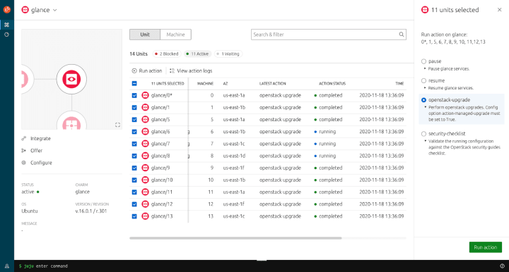
Following on from the UX work that was done for Juju Actions, we’ve taken the wireframes into a design ready for implementation.
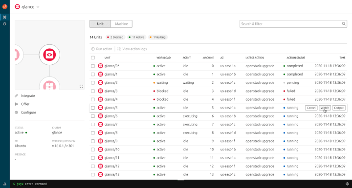
The screenshots below capture the user’s journey to run actions defined for a charm – by selecting an/multiple/all units and triggering the action panel.

Once an action has been run, users are allowed to cancel and watch the action.

We also dedicated a page for action logs, where users can view and filter the action results and outputs.

Charm configuration UI implementation
In the very near future, the dashboard is going to give you the ability to view and edit your charm configuration without needing to drop down to the CLI. So keep an eye out for this in the next release


Vanilla
The Vanilla squad designs and maintains the design system and Vanilla framework library. They ensure a consistent style throughout web assets.
Code snippet and React component
With the recent Vanilla 2.22 release, we introduced the new code snippet pattern as a replacement for the existing code numbered and code copyable components, giving us a consistent way to present code examples in a number of different contexts.
This first step gives developers the ability to add headings to code blocks, as well as choose from three types of a code block: default, numbered and icon.


In an upcoming release, we’ll be introducing several new features, including syntax highlighting with Prism, the ability to switch between related code examples, and a utility class to enable wrapping the content within a code block.


Breaking out of the 12-column grid
We’ve been working on a new section layout that allows content to “break” out of the 12-column grid. This can be useful in cases like tables with many columns, charts with a lot of detail along the x-axis, or for example stores that aim to impress with the abundance of the available content:

Snapcraft and Charmhub
The Snapcraft team works closely with the Store team to develop and maintain the Snap Store site and the Charmhub site.
Backend alignment between stores
The main design goal of Snapcraft and Charmhub is to provide a similar “store experience”. To facilitate the task we worked on sharing as much code as we can between the 2 stores via a python module. This module shares the API logic that is required by the stores.
This iteration the team went back on some of our code that hadn’t been shared. The team refactored some backend code to make sure the 2 stores continued to be aligned.
Update discourse.ubuntu.com theme
A few iterations ago the team updated Charmhub’s discourse theme. This update was about making discourse navigation as close as possible to the site.
The design and web always try to share the same experience across our websites to make a Canonical experience. It was natural to bring this change to Ubuntu’s discourse. We hope you enjoy it.

Snapcraft
Performance improvements
As web developers, we love finding new ways to improve the performance of our web pages. Recently we noticed that some of our snap pages had a low score according to Page Speed Insights, the tool provided by Google to test and suggest performance improvements to your sites
We noticed that all snap pages with a Youtube embedded video, like the Visual Studio Code snap, had a score at their highest of 78. After optimising the way we load the videos, by showing the thumbnail image, then loading and playing the video on click, we got our speed index score above 90 🎉.

Setup A/B test for first snap flow
In order to onboard new developers to snaps, snapcraft.io provides a simple, step by step interactive tutorial to build and publish your first snap to the store.
We would like to run an experiment and move the login step at the first step of the flow. The aim of this experiment is to observe developers engagement with and without being signed in.
In order to do this, we will be running an AB test for the next 2 weeks. Version A will be the current version; Version B will with the login at the first step. Next update in the next blog post. 😉

Charmhub
Libraries sprint follow up
During the roadmap sprint, we met with the teams working on the sharing mechanism for libraries on Charmhub, to discuss our latest progress on the design of how their docstrings will get rendered on the site. We agreed on using Google’s convention for how to write them and showed a couple of designs which aim at making it easier for developers to scan through the docstrings.
After making a few changes that came up during the meeting, we added an index to the page so users can skip through to the sections they are interested in; and worked on the visual hierarchy to make sure it is clear what class a method belongs to.

Team posts:
With ♥ from Canonical web team.
Talk to us today
Interested in running Ubuntu in your organisation?
Newsletter signup
Related posts
Open design: the opportunity design students didn’t know they were missing
What if you could work on real-world projects, shape cutting-edge technology, collaborate with developers across the world, make a meaningful impact with your...
Generating accessible color palettes for design systems … inspired by APCA!
This is the first of two blog posts about how we created the color palette for a new design system at Canonical. In this post I share my journey into...
How we ran a sprint to refresh our design website, Part 2
Part 2 of our series on how our team created content for our design website. Get insights, tools, and lessons to help you run your own design sprint.
