Design and Web team summary – 22 April 2022
Peter Mahnke
on 27 April 2022
Tags: Design
The Web and design team at Canonical run two-week iterations building and maintaining all of the Canonical websites and product web interfaces. Here are some of the highlights of our completed work from this iteration.
Web
The Web team develops and maintains most of Canonical’s sites like ubuntu.com, canonical.com and more.
Ubuntu 22.04 LTS release

This was a big project involving a rework of many pages on ubuntu.com to reflect the release of Ubuntu 22.04 LTS. As well as updating download links, we also overhauled a lot of content on the site. We’ve been busy updating the copy so visitors can see all the latest features and what’s new about the release, updating images to match the new OS and checking that the alternative downloads are working.
It required us to collaborate with Marketing and the different technical owners throughout Canonical extensively. We’ve managed a smooth transition so that anyone visiting ubuntu.com on release day will find it completely up to date with the latest release.
Get Ubuntu 22.04 LTS now
Microk8s.io homepage refresh

We did an overhaul on the content, refreshing the copy and updating and adding new images to the MicroK8s home page. The new content gives visitors an even better overview of our lightweight Kubernetes distribution.
Charmed Kubeflow tutorials

We added a new page to charmed-kubeflow.io gathering together all the tutorials. This page follows similar pages we have created for other sites in our portfolio. It acts as a one stop shop for documentation about how-to for different aspects of the tech.
See our Charmed Kubeflow tutorials
Apps
The Apps team develops the UI for the MAAS project and the JAAS dashboard for the Juju project.
Periodic hardware sync
We introduced the capability to periodically sync and update hardware configuration on deployed machines.

Now a simple change, like adding or removing a disk to a machine will be reflected in MAAS UI without having to go through the whole process of recommissioning and redeployment.
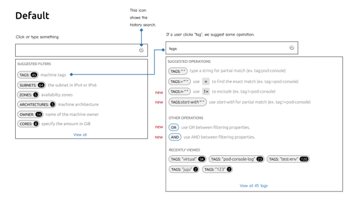
Search and Filtering Exploration
This iteration, we have been exploring different search behaviours based on the problems we have discovered from the previous 2 releases. Read more about our designs here.
In this exploration, we tried to reuse our new search and filtering pattern as a starter template to see if the idea of this pattern fits in with our users’ behaviours.
We know that one problem in our search is that when our users filter their machine list by the machine status or search query, some machine actions trigger changes in the state and those machines will drop out of the main view. So we have decided to remove the filtering mechanism from the search and try to focus on guiding people to create their search query.

Another problem that we have discovered is that our compound search language doesn’t feel natural to users, such as when performing AND, OR, NOT operations it is unclear and not very learnable from the get go.
Vanilla
The Vanilla team designs and maintains the design system and Vanilla framework library. They ensure a consistent style throughout web assets.
Component name updates
We renamed a couple of components this iteration: the Label component is updated to Status Label. Classes such as p-label have been deprecated since Vanilla 3.2 release (use p-status-label instead). Tab Buttons, a section in the Tabs documentation so far, is going to become a separate pattern named Segmented Control.

Layout updates for component pages
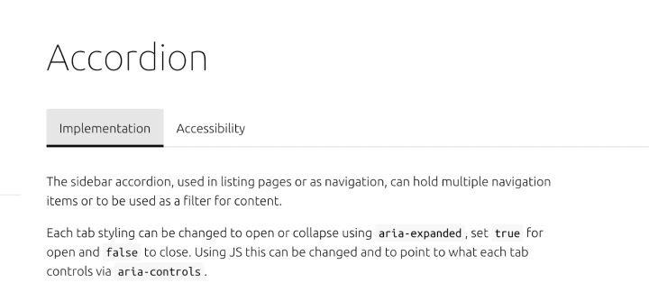
We’ve updated the structure and layout of the component documentation pages. Firstly, we extracted the accessibility documentation into its own page, and have implemented tabs to be able to switch between implementation docs and accessibility docs.

There will soon be a third tab for any component which has design guidelines on discourse. Once finalised for a component, a “Design guidelines” tab will be created and it will be possible to toggle the design content which will be fetched from discourse. This means the content will be editable at any time in the future and the update will be automatically reflected on Vanilla’s website. We documented the process in a short guide which will soon be posted on discourse.
Marketplace
The Marketplace team works closely with the Store, Snapcraft, Snapd and Desktop teams to develop and maintain the Snap Store and Charmhub.
Code alignment between stores
At the moment, snapcraft.io and charmhub.io are different codebases and independent projects sharing the same tech stack. This proposal aims to unify them and share a common framework for the Marketplace tribe.
We want the URLs between the stores to be the same when possible. If the URL path `/search` is available in one store, it should be in the other store, and the most evident difference is that snapcraft.io/store is the equivalent of the charmhub.io homepage. Also, there are many specific code changes, like variables are called snaps, snap, charms, etc. We want to envision something that can be generic between both projects.
These are just some of the improvements we have in mind. Also, we will perform a UX alignment between the stores soon.
Charmhub.io
There were multiple fixes to the mobile experience for our new Topics feature on charmhub, including button alignment and increasing the width of embedded cards.
Related to the embedded cards we’ve implemented a new 404 page for cards.
There were navigation fixes for discourse.charmhub.io – the place to discuss Juju and Charmed Operators.

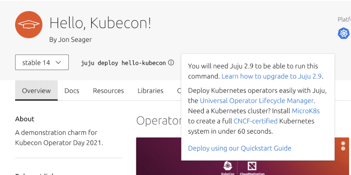
UX complete for reducing the severity of informing users Juju 2.9 is required for charms on the charm detail pages – the solution will be built next iteration.
There was also UX work to improve the “Library” introduction on the details page – as it’s considered far too verbose in most cases.
Snapcraft
Progressive release UI

Progressive releases are a feature we provide where you can release your snap to a partial part of your audience. This has been available via the CLI for some time but now we have a visual representation in the UI. This includes an indication in the table cell showing which version is being released along with a chart to show the progress of the release.
Vanilla upgrade fixes
We updated snapcraft.io to the latest Vanilla version, and there were a few breaking changes that were missed, so here’s a quick summary of some of the fixes we implemented this iteration:
- Double publisher names appearing at some breakpoints
- Some more misaligned checkboxes
- Rogue loading spinners
You can follow the progress of, or report bugs for, both snapcraft.io and charmhub.io by following the Github repositories at canonical-web-and-design/snapcraft.io and canonical-web-and-design/charmhub.io.
We are hiring!
With ♥ from Canonical web team.
Talk to us today
Interested in running Ubuntu in your organisation?
Newsletter signup
Related posts
Generating accessible color palettes for design systems … inspired by APCA!
This is the first of two blog posts about how we created the color palette for a new design system at Canonical. In this post I share my journey into...
How we ran a sprint to refresh our design website, Part 2
Part 2 of our series on how our team created content for our design website. Get insights, tools, and lessons to help you run your own design sprint.
In pursuit of quality: UX for documentation authors
Canonical’s Platform Engineering team has been hard at work crafting documentation in Rockcraft and Charmcraft around native support for web app frameworks...
