
Design and Web team summary – 08 December 2020

Anthony Dillon
on 8 December 2020
Tags: Design
The web team here at Canonical run two week iterations. Here are some of the highlights of our completed work from this iteration.
Web squad
Our Web Squad develops and maintains most of Canonical’s promotional sites like ubuntu.com, canonical.com and more.
Anbox Cloud UI
To make it easier for customers to manage their various Anbox Cloud streams, we have worked with the Anbox team to create a UI for creating and managing Android applications in the cloud.

Ubuntu tutorials get search
We now have enough tutorials that we needed a search facility. Hopefully is helps you quickly find a tutorial that you are interested in.

Resources and takeovers
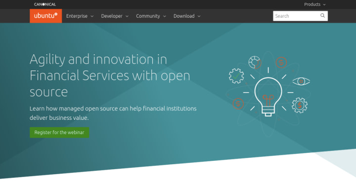
Financial services agility webinar
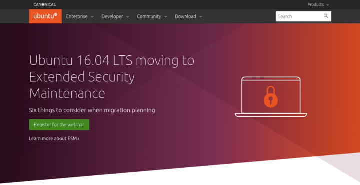
Ubuntu 16.04 LTS moving to ESM
Ubuntu Pro on AWS webinar

Brand
The Brand team develops our design strategy and creates the look and feel for the company across many touch-points, from web, documents, exhibitions, logos and video.
MicroK8s workshop
We ran a workshop with the MIcroK8s team to determine the way the brand is currently working and to define what direction to take going forward and what assets are needed to achieve it.

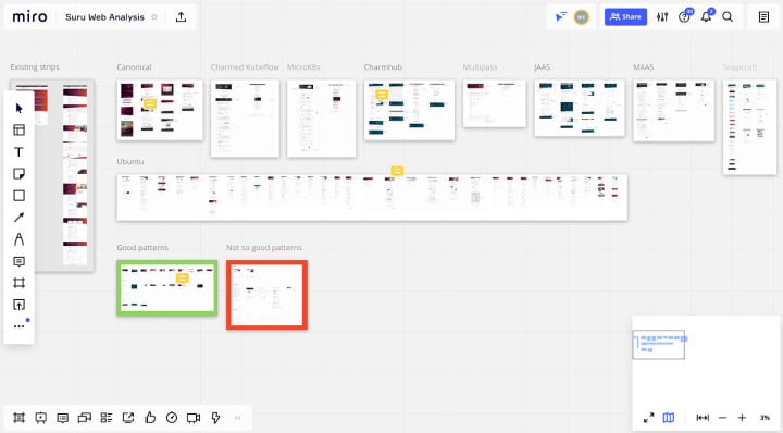
Suru analysis workshop
We ran a workshop with the rest of the design team to go through the analysis done on the use of suru across the web, work out which patterns to take forward and identify areas that need improvement.
MAAS
The MAAS squad develops the UI for the MAAS project.
Frontend legacy code migration (Machine summary)
Work is continuing on the migration of machine details from AngularJS to React. We’ve made some internal improvements to the error handling, fixed a number of bugs and upgraded to React 17. We are gearing towards 40% completion in this iteration and hope to complete more features before the holidays.
PCI device modelling
Our design team is currently finalising the PCI and USB modelling working for the UI. This feature would help our users discover all PCI devices and detect foreign USB devices connected to their machines. PCI and USB information can be achieved by lspci and lsusb in the linux environment, so we are bringing this transparency to the UI. The final design displays network cards and smartNICs under Network, where users may configure these devices later. We also allow configuration on NVME storage devices from this feature. Our future work includes allowing GPU configuration and potentially selecting pertinent drivers.
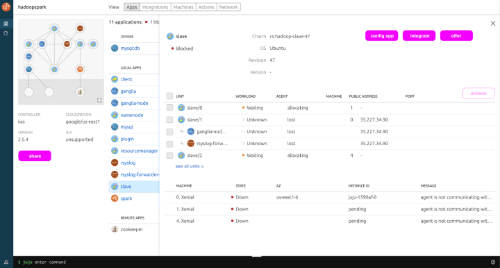
JAAS
The JAAS squad develops the JAAS dashboard for the Juju project.
IA and hierarchy of content and interactions
As JAAS Dashboard transitions from a read-only UI which relies on the integrated Juju shell for CLI interactions to an interactive functionality in the UI, highlighting the need to work on a hierarchical approach to the entry points for these interactions.
The team is spending some time in workshops on this information architecture definition. In the initial exploration we have defined the relations in the dashboard and actions according to the Juju model structure and elements:
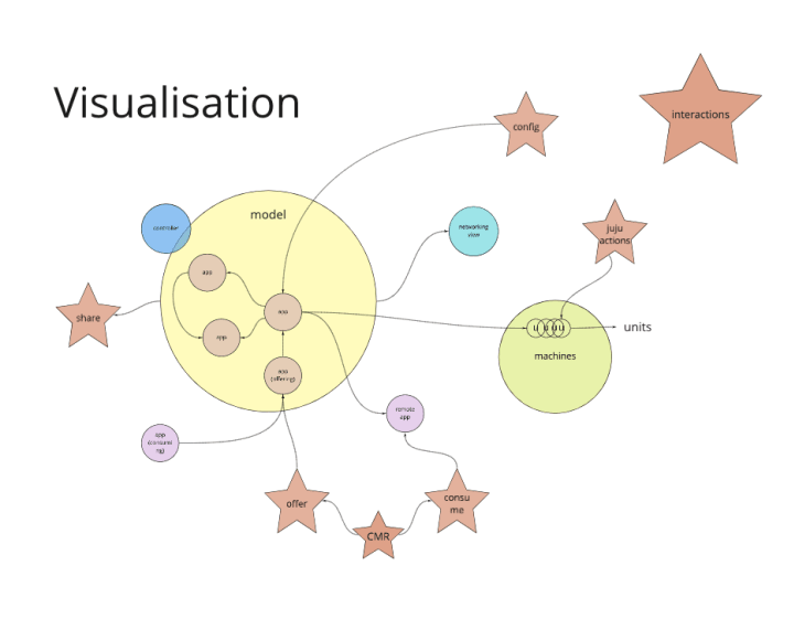
We then applied this structure visualisation to the hierarchy of the pages/views, assigning levels with incremental depth in Juju model (e.g. models>model>app>unit)

Finally, we defined a rule to help us to place the right call to action at the right position in the user-journey: “CTA/interactions are triggered within the same page/view in relation to where you are in the flow, according to the hierarchy placement”. With this exercise, we could start wireframing the entry points and explore solutions across the screens.
On the development side, we shipped several UI improvements including a unified status strip across the app, added subtle animations on-page and login component load and fixed several obscure bugs after a review of our Sentry backlog.

We have landed an important, if invisible, change in that the dashboard now communicates with Juju via our rewritten jujulib – the JavaScript library we use to talk to the Juju backend. This represented a large effort which will allow us to move and iterate more quickly in future.
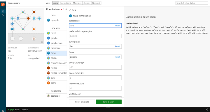
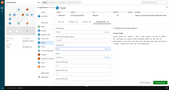
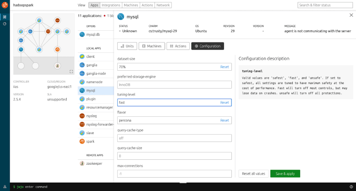
Charm configuration
This iteration we’ve been looking at how to incorporate app configurations into the dashboard. We started off with some research and discovery to identify the varying degrees a given app offers in terms of configuration. Whilst some apps can only have a few parameters others other a high degree of customisation so we needed to explore different ways on how this could scale as well as identifying the right balance of being helpful in how the descriptions are displayed whilst being mindful of more seasoned users who know there a way around the apps they interface with daily.
There is still some more work to be done in identifying where best to display this information as well as the overall information architecture of the dashboard as we look to include more functionality and features in the coming releases.
Here are some ideas we’ve been exploring. We’d be grateful for any feedback our community has.
Vanilla
The Vanilla squad designs and maintains the design system and Vanilla framework library. They ensure a consistent style throughout web assets.
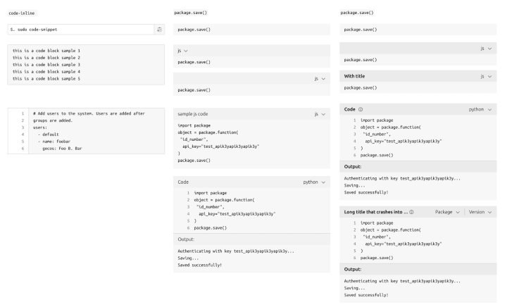
Code snippet design
We’ve been working on redesigning the code snippet component to have a consistent look for all different variants of it and provide more features.
Improvements to side navigation in application layout
We continue our work on improvements to the application layout. The focus of this iteration was the navigation panel. We tweaked the spacing and improved the way the Vanilla side navigation component works when used in the application layout.

New application icons
We started adding more icons from the updated Canonical set. The first batch includes a couple of icons used in our applications. These additional icons will not be included in Vanilla styles by default to prevent an unnecessary increase of the file size, but any project that needs them will be able to include new icons individually into their CSS.

Snapcraft and Charmhub
The Snapcraft team works closely with the Store team to develop and maintain the Snap Store site and the upcoming Charmhub site.
Snapcraft
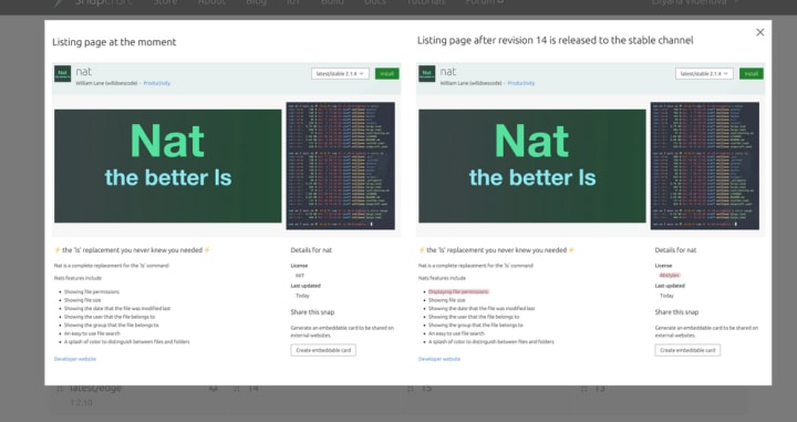
UX Upload metadata
We are working on updating the behaviour for snap releases. When a snap will be released to stable the metadata of the snap will be updated with the latest information from the snapcraft.yaml file. We worked on a visual representation of those changes. This is the proof of concept that the team came with:
Source code link for snaps metadata
As open-source lovers, we see a lot of great snaps published on the snap store that share the same interest. We started a UX exploration to see why and how we can integrate the source code link for snap publishers. This would give more visibility to snap publishers to share their applications and code. This follows the charm details pages on charmhub.io.
Build manage users admin pages
We are migrating the brand store management features from dashboard.snapcaft.io to snapcraft.io. The team implemented the user and settings management for a brand store.
Charmhub
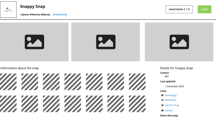
Listing pages
The team started adding the ability to modify your charm metadata via a listing page. This section of the site is still under development, so not publicly available yet.

Library tab
This work is work-in-progress, but what we are trying to do is incorporate libraries to the publisher pages. Initially, we are exploring the possibility for charmers to be able to see their libraries and manage the visibility (private or public). The pages are:
- Libraries design: follows the current functionality on charm craft, to explore what can and can’t we do in the UI.
- Libraries empty: empty state of the tab with the process to add a new library.
- Libraries: view of the libraries the publisher has
- Individual library version: on the previous page they can click on a version to see what the content of the library was in each of them. They can also use this page to preview how their libraries will be displayed.

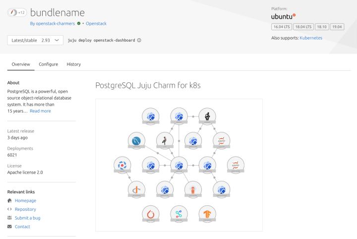
Charmhub bundle pages
We updated the designs of the bundle pages to bring them in line with the rest of the Charmhub detail pages.
Team posts:
With ♥ from Canonical web team.
Talk to us today
Interested in running Ubuntu in your organisation?
Newsletter signup
Related posts
Generating accessible color palettes for design systems … inspired by APCA!
This is the first of two blog posts about how we created the color palette for a new design system at Canonical. In this post I share my journey into...
How we ran a sprint to refresh our design website, Part 2
Part 2 of our series on how our team created content for our design website. Get insights, tools, and lessons to help you run your own design sprint.
In pursuit of quality: UX for documentation authors
Canonical’s Platform Engineering team has been hard at work crafting documentation in Rockcraft and Charmcraft around native support for web app frameworks...