
Design and Web team summary – 01 March 2021

Anthony Dillon
on 1 March 2021
Tags: Design

The web team at Canonical run two-week iterations building and maintaining all of Canonical websites and product web interfaces. Here are some of the highlights of our completed work from this iteration.
Web squad
The Web Squad develops and maintains most of Canonical’s sites like ubuntu.com, canonical.com and more.
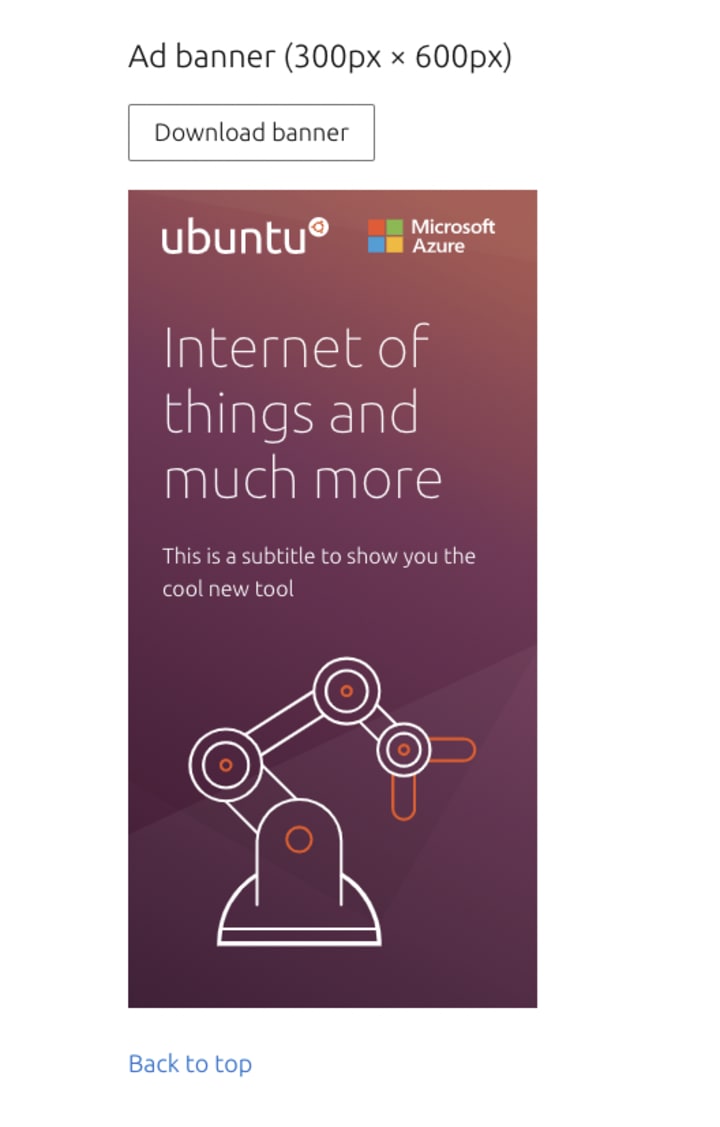
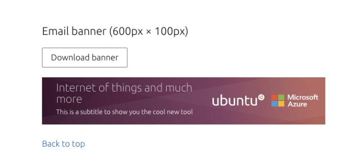
This iteration the web squad added some new features to our social banner builder, giving a wider range of ad banners used by marketing. Including adding the functionality to choose the logo, and improving the download filename.

If you are looking for a tool to make meta images, social media banners, visit our tools.demo.haus project.
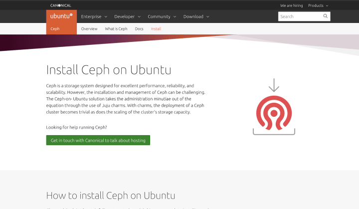
New Ceph Install page
We released a new page with instructions on how to install Ceph on Ubuntu.
Brand
The Brand team develops our design strategy and creates the look and feel for the company across many touch-points, from web, documents, exhibitions, logos and video.
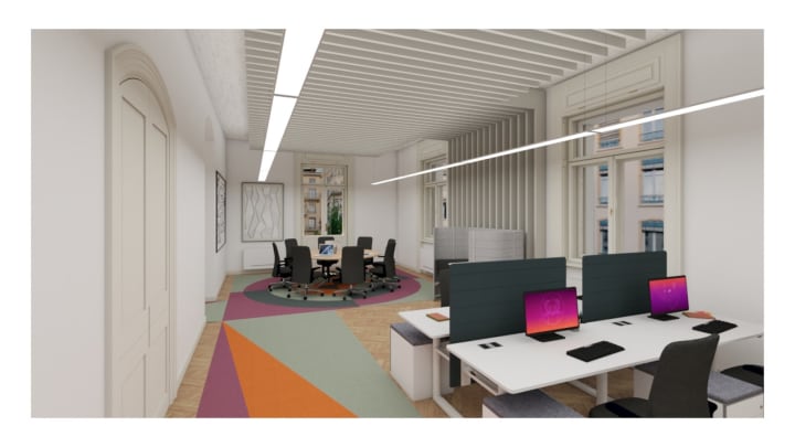
Bratislava office design
Finalising the layout and colour choices for the new office in Bratislava.
Ubuntu Pro banners
We produced some carousel banners to run on Microsoft.com to promote Ubuntu Pro running on Microsoft


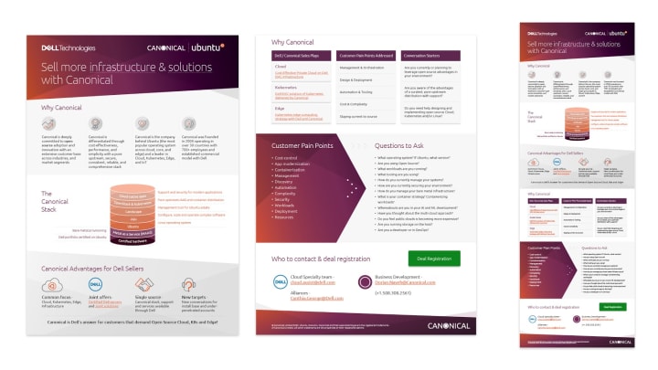
Dell battlecards
After finishing the presentation battlecards for the sales team, we were asked to translate them into a single and 2 page infographic
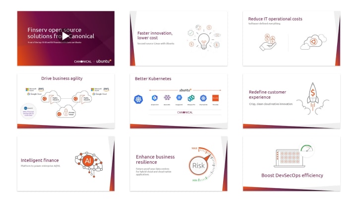
Finserv animation
Working with the sales team, we worked on a storyboard for an upcoming animation to tell the story of Ubuntu and Canonical in the financial services vertical.
Master brands
We also continued our brand hierarchy work exploring our two master brands and how they live and work together in all forms of the business and media executions.
MAAS
The MAAS squad develops the UI for the MAAS project.
Solving visual scalability in MAAS as LXD tenants feature
While wrapping up the final design for our LXD project dashboard, we’ve been asking ourselves if this is the best way to scale this graph design. During the discovery phase, we found that our users looked at the information on the table and made associations with the graph in order to compose their VMs and allocate their resources properly based on these data. The problem with the former presentation of the storage graph is that it shows the aggregated data, which is not useful for anyone to make a good decision regarding their resources. So in the earlier phase of the prototype, we tried to put these storage pools into different color buckets and expand these color sections into a card.
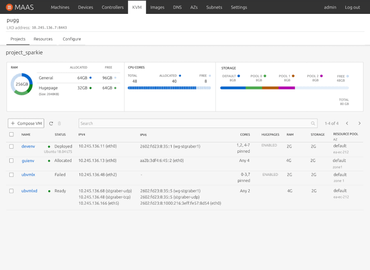
However, after we tried scaling this view a little further, this view can only scale up to 8 storage pools, maximum. So we revisited a few other practical use cases that we could find in our LXD exploration. One of the edge cases that we discovered had a total of 32 storage pools. From here randomizing 32 different colors and scaling this information for 32 different storage pools seems a little counterintuitive. The question then becomes is colour the best element to represent this information? Is there a different way we can make this space useful? What if it’s not a graph?
After a few ideation sessions, one of our colleagues came up with a brilliant solution that doesn’t rely on colours as the main factor. From the example above, when there are fewer than 3 storage pools, a normal bar graph would be the default view. When there are more than 3 but fewer than 18, the content will be displayed as a rectangular block with enough hints to hover over the component for expanded information. And when it grows beyond 18 pools, we will reduce the size of the item but still highlight the important information.
This is not the ultimate final version. We are still thinking about how to make this better and more consistent with our current designs. If you’ve got more edge cases that you’d like to share, your feedback is more than welcome.
JAAS
The JAAS squad develops the JAAS dashboard for the Juju project.
JAAS navigation restructure
After an iteration of user feedback gathering, we restructured our dashboard sitemap to display information of models, apps, machines and units, also to fit in new interactive features in our future scope.
We decided to pursue breadcrumbs, reflecting the current location in the site’s hierarchical structure (working together with the global navigation on model level), as our navigational element to support JAAS users’ wayfinding.

Panel Layout
On the development side, we spent a lot of this iteration refactoring and moving the layout furniture around to support the aforementioned navigation restructure. We are now using Vanilla Panels instead of our own custom component and have re-architected the Juju Dashboard to support individual entity pages.
Vanilla
The Vanilla squad designs and maintains the design system and Vanilla framework library. They ensure a consistent style throughout web assets.
Embedded examples in Vanilla docs
Over a year ago we started using CodePen for embedding examples in Vanilla documentation. While CodePen is a very useful tool, the sheer volume of embeds on a given page meant that load times for each example could be excessive. With our next release, we’ll be replacing CodePen embeds in the Vanilla docs with the code snippet pattern we recently introduced.
By using code snippets instead, we were able to reduce those load times significantly and increase page performance. We wanted to be able to keep the benefits CodePen provides, so we also replicated the “Edit on CodePen” link the embeds previously had, and appended them to each code snippet.

Accessibility improvements
Following on from our recent accessibility audit, this iteration we made three small improvements and recommendations to buttons to improve their accessibility:
- If a button launches a dialog, such as a modal, we now recommend that the button’s label text is followed by an ellipsis character (…). This is a common convention, used to indicate to the user that clicking the button will immediately launch something that requires their input in some way.
- When a button launches a dialog, focus should programmatically be placed on the launched element, to aid in keyboard navigation when tabbing between elements.
- We also added styling to button elements for the “aria-pressed” attribute. There are some contexts where, even after a button has received user input, whether by mouse or keyboard event, we want to show that the button is still being engaged with on some level. An example of this is a button used as a toggle for a contextual menu. When the menu is visible, we programmatically set the “aria-pressed” attribute, and the button clearly indicates that it is still being engaged with.

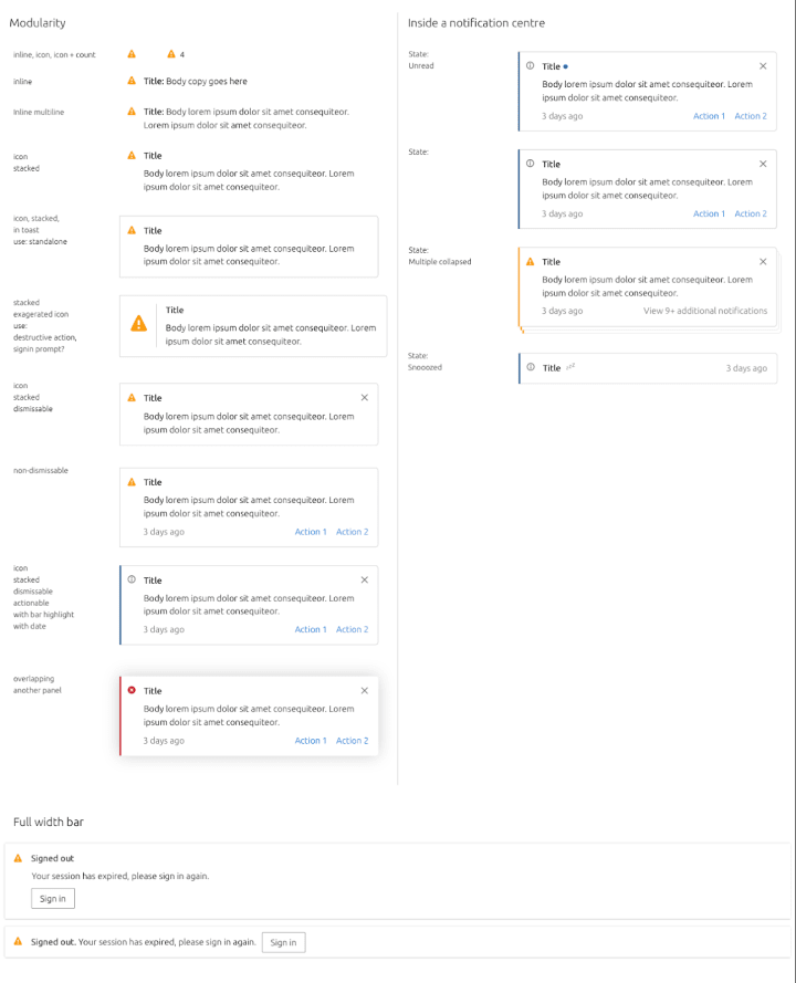
Notifications design
We’ve been working on a modular notification system. The image below provides a sneak peek of what the new notifications will look like.
Snapcraft and Charmhub
The Snapcraft team works closely with the Store team to develop and maintain the Snap Store site and the upcoming Charmhub site.
Candid SSO for identity providers
Candid is an identity provider service. We updated the views to support multiple providers. We used the Vanilla validation pattern and restyled the identity provider buttons and added icons.
Snapcraft
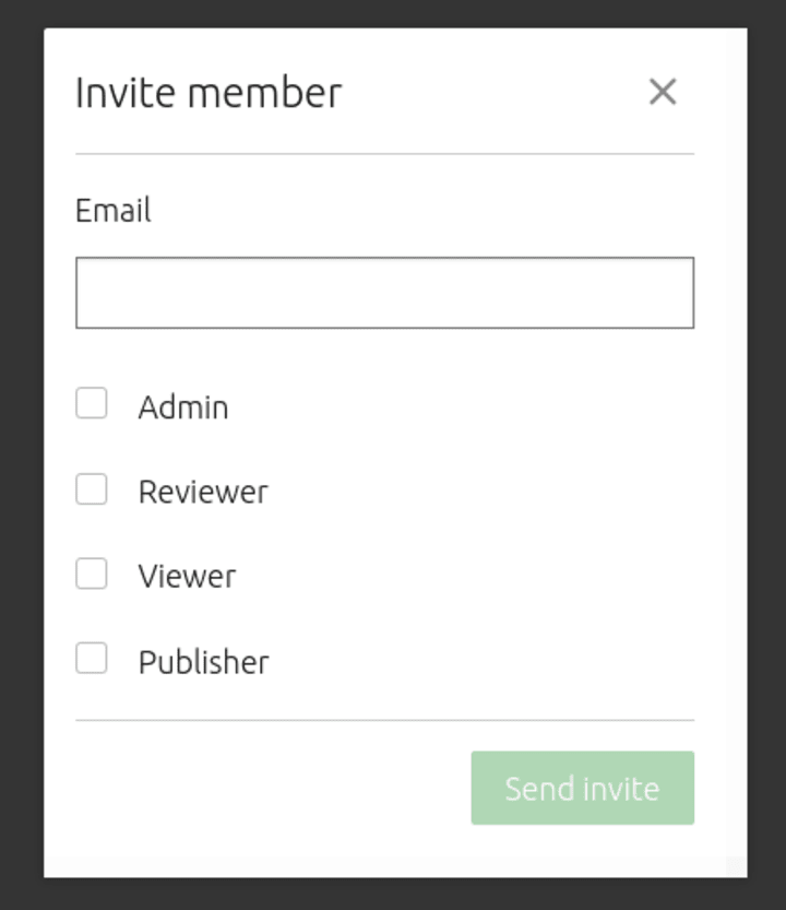
Brand store admin pages
Finished the manage invites section and moved the invite members form from the manage members page to the invites page.
Charmhub
Featured charms from the API
Previously the featured charms on the homepage were hardcoded which caused back and forth between the web team and product management. But now we fetch the featured charm list directly from the API. Check out the featured charm list on charmhub.
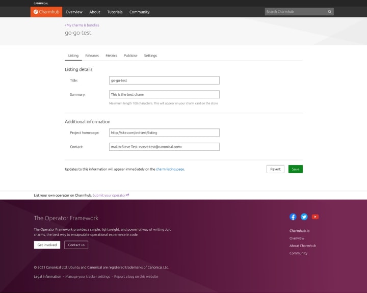
New developers pages
We are adding new pages for developers: the listing and the publicise page. The listing page will allow a developer to update some discoverability metadata like summary, urls and other. The publicise page will help a publisher to share his charm with GitHub badges or buttons to integrate directly in their website.
Team posts:
- Supporting “I don’t care about cookies”
- Regex basics
- Improving the code experience in Vanilla
- Open source, teamwork and mental health: my FOSDEM 2021
- Add docs to your charm page
- Create a new charm for testing
With ♥ from Canonical web team.
Talk to us today
Interested in running Ubuntu in your organisation?
Newsletter signup
Related posts
How we ran a sprint to refresh our design website, Part 2
Part 2 of our series on how our team created content for our design website. Get insights, tools, and lessons to help you run your own design sprint.
In pursuit of quality: UX for documentation authors
Canonical’s Platform Engineering team has been hard at work crafting documentation in Rockcraft and Charmcraft around native support for web app frameworks...
Improving our web page creation workflow: how structured content is slashing design and development time
Co-authored with Julie Muzina A year ago, during our Madrid Engineering Sprint, we challenged ourselves to dramatically reduce, or even eliminate, the need...