
%27%20fill%3D%27%23E95420%27%3E%3Cpath%20d%3D%27m15.839%205.293-1.447-2.8a.136.136%200%200%200-.051-.055.144.144%200%200%200-.074-.02h-5.8a.143.143%200%200%200-.091.03.13.13%200%200%200-.034.17.138.138%200%200%200%20.072.06l7.251%202.8a.144.144%200%200%200%20.17-.054.13.13%200%200%200%20.007-.13l-.003-.001ZM11.839%204.945.073.223A.073.073%200%200%200%20.026.221a.07.07%200%200%200-.038.027.065.065%200%200%200%20.007.086l7.962%208.182a.069.069%200%200%200%20.049.022.072.072%200%200%200%20.047-.019l3.805-3.461a.066.066%200%200%200%20.02-.061.065.065%200%200%200-.014-.03.07.07%200%200%200-.028-.02l.003-.002ZM5.382%207.183a.071.071%200%200%200-.062-.022.07.07%200%200%200-.03.011.067.067%200%200%200-.023.025l-4.13%207.696a.065.065%200%200%200-.005.046.068.068%200%200%200%20.027.038.072.072%200%200%200%20.09-.006L7.13%209.18a.066.066%200%200%200%200-.087l-1.75-1.91Z%27%2F%3E%3C%2Fg%3E%3Cdefs%3E%3CclipPath%20id%3D%27a%27%3E%3Cpath%20fill%3D%27%23fff%27%20d%3D%27M0%200h15.83v15.21H0z%27%2F%3E%3C%2FclipPath%3E%3C%2Fdefs%3E%3C%2Fsvg%3E)

%27%20fill%3D%27%23E95420%27%3E%3Cpath%20d%3D%27M1.936%202.592c.668%200%201.21-.515%201.21-1.151S2.604.29%201.936.29C1.267.29.726.805.726%201.44c0%20.637.541%201.152%201.21%201.152ZM14.56.576H3.404a1.587%201.587%200%200%201%20.024%201.69l-.026.04h11.156a.56.56%200%200%200%20.386-.15.518.518%200%200%200%20.16-.369v-.692a.502.502%200%200%200-.16-.369.543.543%200%200%200-.386-.15ZM1.936%206.701c.668%200%201.21-.515%201.21-1.15%200-.637-.542-1.152-1.21-1.152-.669%200-1.21.515-1.21%201.151s.541%201.151%201.21%201.151ZM14.56%204.685H3.404a1.612%201.612%200%200%201%20.242%201.083c-.03.215-.105.421-.219.608l-.026.04h11.157a.56.56%200%200%200%20.386-.15.518.518%200%200%200%20.16-.37v-.692a.5.5%200%200%200-.16-.369.542.542%200%200%200-.386-.15ZM1.936%2010.81c.668%200%201.21-.515%201.21-1.15%200-.637-.542-1.152-1.21-1.152-.669%200-1.21.515-1.21%201.151s.541%201.151%201.21%201.151ZM14.56%208.795H3.404a1.611%201.611%200%200%201%20.243%201.082%201.581%201.581%200%200%201-.245.648h11.156a.559.559%200%200%200%20.386-.15.517.517%200%200%200%20.16-.37v-.692a.502.502%200%200%200-.16-.368.543.543%200%200%200-.386-.15ZM1.936%2014.92c.668%200%201.21-.515%201.21-1.15%200-.637-.542-1.152-1.21-1.152-.669%200-1.21.515-1.21%201.151s.541%201.151%201.21%201.151ZM14.56%2012.904H3.404a1.611%201.611%200%200%201%20.242%201.082%201.58%201.58%200%200%201-.219.608l-.026.04h11.157a.562.562%200%200%200%20.386-.15.517.517%200%200%200%20.16-.37v-.692a.5.5%200%200%200-.16-.369.543.543%200%200%200-.386-.15Z%27%2F%3E%3C%2Fg%3E%3Cdefs%3E%3CclipPath%20id%3D%27a%27%3E%3Cpath%20fill%3D%27%23fff%27%20d%3D%27M0%200h15.83v15.21H0z%27%2F%3E%3C%2FclipPath%3E%3C%2Fdefs%3E%3C%2Fsvg%3E)
%27%20fill%3D%27%23E95420%27%3E%3Cpath%20d%3D%27M9.618.272c-.634%200-1.243.243-1.691.674-.448.43-.7%201.015-.701%201.624v4.221a1.9%201.9%200%200%201%201.362%200v-4.22a.955.955%200%200%201%20.291-.72%201.067%201.067%200%200%201%201.479%200%20.955.955%200%200%201%20.29.719v.962h1.363V2.57c0-.61-.253-1.194-.702-1.625A2.445%202.445%200%200%200%209.618.272ZM9.017%208.433c0%20.21-.065.417-.187.593a1.102%201.102%200%200%201-.499.393c-.203.08-.426.102-.642.06a1.125%201.125%200%200%201-.568-.292%201.055%201.055%200%200%201-.304-.547%201.028%201.028%200%200%201%20.064-.616c.084-.195.226-.362.41-.479a1.143%201.143%200%200%201%201.401.133c.103.1.185.217.24.347.057.129.085.268.085.408ZM2.773%205.855c-.634.001-1.242.244-1.69.674C.633%206.96.381%207.545.38%208.154v4.082a1.901%201.901%200%200%201%201.363%200V8.154a.955.955%200%200%201%20.29-.719%201.067%201.067%200%200%201%201.479%200%20.955.955%200%200%201%20.29.719v.962h1.363v-.962c0-.61-.253-1.194-.702-1.625a2.444%202.444%200%200%200-1.69-.674ZM2.166%2013.878c0%20.21-.065.415-.186.59-.121.174-.294.31-.496.39-.202.08-.424.102-.638.06a1.119%201.119%200%200%201-.565-.29%201.049%201.049%200%200%201-.302-.543c-.043-.206-.02-.42.063-.614.084-.194.225-.36.407-.476a1.136%201.136%200%200%201%201.394.133%201.024%201.024%200%200%201%20.323.75Z%27%2F%3E%3Cpath%20d%3D%27M14.752%204.76a1.789%201.789%200%200%201-.681-.126v2.411a.972.972%200%200%201-.312.682c-.193.179-.45.28-.718.28-.268%200-.526-.101-.718-.28a.972.972%200%200%201-.312-.682V4.32h-1.363v2.726c0%20.61.252%201.195.7%201.626a2.443%202.443%200%200%200%201.692.673c.635%200%201.244-.242%201.692-.673.449-.431.7-1.016.7-1.626v-2.41a1.9%201.9%200%200%201-.68.125ZM15.858%202.822c.037.225%200%20.455-.107.658a1.1%201.1%200%200%201-.49.472%201.161%201.161%200%200%201-1.302-.198%201.04%201.04%200%200%201-.206-1.251%201.1%201.1%200%200%201%20.492-.47%201.161%201.161%200%200%201%201.299.199c.166.16.276.366.314.59ZM7.907%2010.2c-.233%200-.465-.042-.681-.126V12.6a.97.97%200%200%201-.302.7%201.05%201.05%200%200%201-.728.29%201.05%201.05%200%200%201-.728-.29.97.97%200%200%201-.302-.7V9.845H3.804V12.6c0%20.61.252%201.194.7%201.625a2.443%202.443%200%200%200%201.692.674c.634%200%201.243-.243%201.692-.674.448-.43.7-1.015.7-1.625v-2.526a1.887%201.887%200%200%201-.68.127Z%27%2F%3E%3C%2Fg%3E%3Cdefs%3E%3CclipPath%20id%3D%27a%27%3E%3Cpath%20fill%3D%27%23fff%27%20d%3D%27M0%200h15.83v15.21H0z%27%2F%3E%3C%2FclipPath%3E%3C%2Fdefs%3E%3C%2Fsvg%3E)

Cueing up users

Canonical
on 9 June 2014
Tags: Design
The bottom edge swipe gesture is simple and accessible for users, so it’s strategic for application developers. By giving instant access to the most needed settings, controls, and views through the bottom edge, app developers have a powerful tool for crafting more useful and usable experiences.
In earlier postings we’ve talked about how the bottom edge can be harnessed effectively, but helping users to get curious about this special place on the interface is the key to unlocking the full value of an app. The solution is simple and elegant: smart cues.
What is a cue?
On first glance, the bottom edge cue is just a tiny label space that pops up when an app is opened, looking much like a simple tab or handle. When the user grabs it, or simply swipes up, anywhere along the bottom edge, the edge is activated normally.
The cue component can stay on screen as a label, or retract to a minimal handle that doesn’t clog the screen or distract from the user’s primary task. Finally, and perhaps most interestingly, the cue can become an app indicator bar, reminder the user about which settings are currently selected.
How to cue
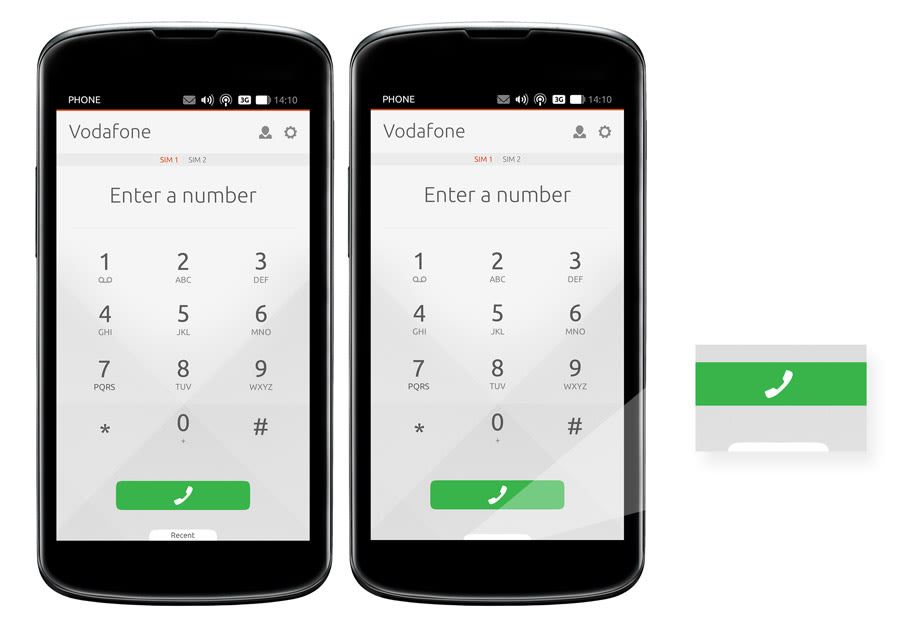
For many apps, the bottom edge is ideal for providing a simple, always-accessible way for users to compose a new item like a message, note or add to a list of things. A cue for this purpose can be as straight forward as a “Create New” text label that slides up when the app is loaded to remind users of the action, but then retracts neatly to either a simple handle, or altogether, as the user interacts with other parts of the application. The minimized cue can remain on top of the screen if desired, providing users with an unobtrusive but persistent cue.
Combination cue and indicators

While a simple cue such as “create new” may be just right sometimes, but in some cases where settings or controls are located in the bottom edge, cues can work even harder, providing the user with an indicator bar of current setting. For example, in the camera app, the bottom edge cue shows the current flash setting and whether GPS tagging of photos is enabled. If the user triggers the bottom edge, controls for all of these settings are revealed.
Please and cues
Before you finalize your app design, think about how the bottom edge can help you deliver the most pleasing and effective user experience. Part of this plan should include the best use of the bottom edge cue, either as a label, a settings indicator, or both. Make it easy for users to discover what the bottom edge can do, and get more from your application.
Talk to us today
Interested in running Ubuntu in your organisation?