
New Apps header
Canonical
on 13 March 2014
Tags: Design
The new apps header features max. 4 slots that can be arranged and combined in order to fulfil user needs in every screen.

Header’s values
We want to provide our users with the right amount of contextual information for them to know:
1- Where they are at (inside the app, in a particular view).
2- Where they can go inside the app in order to find content (navigate across different views).
3- What they can achieve in any given view (compose a message, crop a picture…).
The new header provides clarity by always showing the user where they are at, consistency by providing a way to navigate across main views inside the apps, and priority by surfacing the most important actions in every screen.

Header’s elements
The elements are the building blocks of the header, the controls that can placed inside the slots mentioned above.
There’s different categories of elements and each of them have to be positioned carefully in the header in order to create slick experiences across our apps.

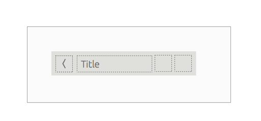
Title
One of the main values behind the new header is Clarity: we want the user to be clear about where they are at any moment.
That’s why the only mandatory element for our header is the title; you can leave some other slots empty, but every header has to have a title.

Tabs
A Tab is a control that allow users to navigate across views directly from the header.
The main views of your app are the different faces in how content is organised and visualised.
 Example:
Our telephone app has two main views: Dialer and Contacts. Placing a tabs on the telephony header, allows users to toggle between this two views quickly.
Tabs placement
Place the tabs right to the title.
According to our interface values “right” means moving forward, and that’s what a tab precisely is, moving forward to the next view represented by the tab icon.

Actions
Actions allow users to accomplish a direct goal in every screen (compose a message , edit, crop a picture…) Give priority to the actions that will be used more often and place them in the header.

Example: Our address book app has a clear primary action which is add a new contact to the list.Placing that action straight to the header will make the user accomplish the goal quicker and smoother.
Actions placement
Place the actions right to the title as well.

In case you want to mix tabs and actions on the same header, keep the tabs as close to the title as possible, creating a natural block to navigate across the views; place the actions after them.

Back
After the main views of your app, subsequent views will use a back button in the header to navigate back to the main views. Back always returns to the previous view of an app, until the user reaches the main view again.

Example: Our gallery app has 3 main views: Photos, events and albums. Once the user gets to a detail view, the header of that view has a back button that returns the user to them main view where he came from.
Back placement
There’s only one place where you can place the back, and that’s the top left slot. According to our interface values, that’s a place where user has to intentionally stretch the finger and make an effort to trigger.
 Drawer

So we’ve already introduced a few elements, but what happens when there’s not enough free slots on the header to place all your tabs and actions? Our solution is the drawer: an overflow where users will find all the controls not available straight on the header.

Example: Our gallery app has 3 main views: Photos, events and albums; and it also has the “take a picture” action on the header. In order to keep the header clear, we’ve decided to place the main views inside a drawer, and surface “take a picture” on the header. In this particular case, the drawer contains the main views of the app.
Inside the drawer
The drawer can contain some of the elements that couldn’t fit in the header’s slots. If the drawer is placed on the top left slot, then it will contain tabs (main views); if the drawer is placed on the top right slot, then it will contain extra actions.

Drawer placement
The drawer works as a metaphorical extension of the header, so placing it at the first or last slot helps reinforce that idea.

Search
Search is a special action that allows users to rapidly locate a desired piece of content. And since search can be a really important use case in apps, we are providing a special experience for it.Triggering search will refresh the standard header into a search header, displaying the osk at the same time, and removing the focus from the content. (for more information on search read search pattern)

Example: Our notes app presents search as one of the main action in the header. Once the user hits on the search icon the header transitions to the search header.
Search placement
There’s only one place in the header where you can place search: top right slot.

Implication with the drawer: In the scenario where you need a back button, a drawer and a search; the search will need to be kept in the top left slot in order to reinforce the search pattern across all our system.

Header layout
The four slots on the header can be arranged as follows:
Layout A
1 slot at the left of the title and max. 2 slots on the right

When to use it
- You need to use a Back button in order to display detail screens for your app content.
- Your app has a large number of main views and you need the drawer to display all of them.
- You prefer to use the slots on the right to display actions, then you have to use a drawer to place the main views.
Layout B
max. 3 slots right to the title
 When to use it
- You don’t need a back button.
- You want to place tabs at the right for the user to be able to switch views easily.
- Most of the actions to be performed on the app are contextual (related to the content) and there’s no need to surface those actions on the header.
Behaviour
According to our user interface values, content is always the priority; that’s why the header is just a tool the disappears when users don’t need it. By scrolling down, the header will disappear. By scrolling up the header will slide in again.
 It might be scenarios where users will need the header present at all times (i.e. Header with tabs) in that justified case, it’s possible to set the header fixed on the screen.
Talk to us today
Interested in running Ubuntu in your organisation?
Newsletter signup
Related posts
How we ran a sprint to refresh our design website, Part 2
Part 2 of our series on how our team created content for our design website. Get insights, tools, and lessons to help you run your own design sprint.
In pursuit of quality: UX for documentation authors
Canonical’s Platform Engineering team has been hard at work crafting documentation in Rockcraft and Charmcraft around native support for web app frameworks...
Improving our web page creation workflow: how structured content is slashing design and development time
Co-authored with Julie Muzina A year ago, during our Madrid Engineering Sprint, we challenged ourselves to dramatically reduce, or even eliminate, the need...